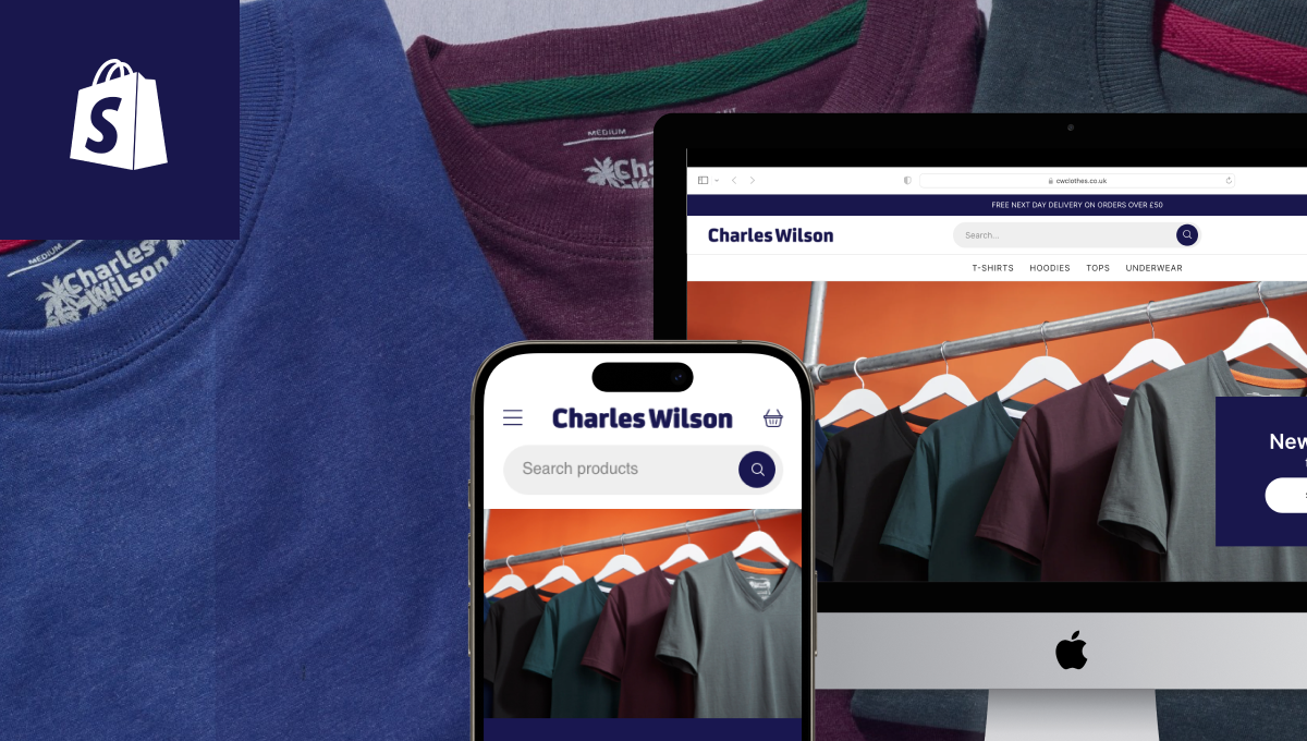
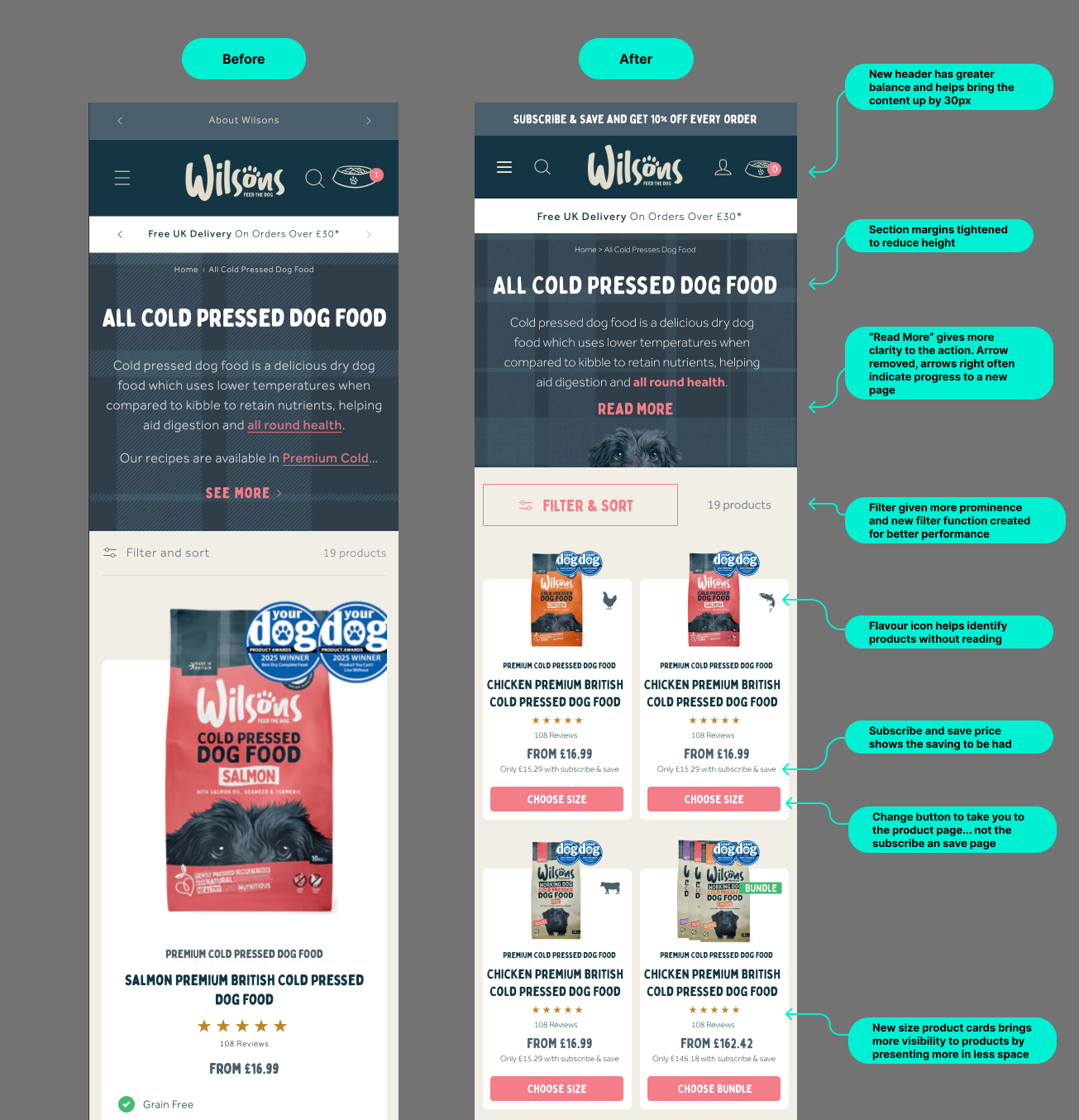
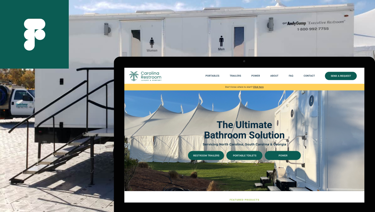
Discover practical ways to fix any flaws & weaknesses in your website!
Get a free audit of your ecommerce store. Fix issues before they start costing you a fortune. 🛠️
Wilsonspetfood.co.uk: Small UX/UI Fixes that Make a Big Difference
Wilsons Pet Food decided to improve their online store’s performance. Through strategic UI/UX enhancements, we tried to streamline the user journey and strengthen customer trust, creating a smoother, more engaging shopping experience for pet lovers.
Wilsons Pet Food is a heritage British brand with over 160 years of experience in pet nutrition. Known for its high-quality, natural ingredients and commitment to sustainability, Wilsons offers a wide range of cold-pressed and raw dog food tailored to support pets’ health and wellbeing.
In ecommerce, it’s easy to chase massive overhauls and forget the power of micro-optimisations. At MageCloud, we believe that small changes – when executed correctly – can completely transform the customer experience. Our recent collaboration with Wilson’s Pet Food, a trusted UK pet food brand, is a perfect example.
Below, we highlight key updates and insights from our recent work, provided by our UX/UI expert, Adam Forshaw.
The Challenge: Good Site, Better Potential
Wilsons already had a solid Shopify-based website: clean, trustworthy, and loved by returning customers.
But beneath the surface, there were missed opportunities. Our goal was to unlock that potential by improving navigation, boosting lead generation, and ensuring high-performing content channels actually drove sales.
Using heatmaps and analytics, we uncovered some key issues:
Low engagement beyond the fold: Especially on mobile, most users weren’t scrolling or interacting with content further down the page.
Underperforming CTAs: Key call-to-actions had click-through rates as low as 0.09%, suggesting a lack of clarity and visual hierarchy.
Wasted prime real estate: Pages like “About” were taking up valuable header space while contributing less than 0.2% to conversions.
Strong blog traffic, weak conversion: Their blog was a major traffic source, but visitors weren’t making their way into the product catalog or sampling journey.
Key areas of concern included layout balance, customer navigation flow, and visibility of key product details.
We took a strategic approach to address these pain points – starting with navigation redesign, highlighting product samples, improving filter usability on PLPs, and reworking blog UX to introduce trust signals, product teasers, and smart lead capture.
Objectives.
Improve user experience and engagement through targeted UI/UX enhancements.
Showcase Wilsons’ product catalog more effectively to boost discoverability and conversions.
Simplify navigation and filtering to help customers find products faster and with less friction.
Enhance blog usability to increase time on site, SEO performance, and customer education.
Clarify key actions and pricing to improve conversion rates and reduce confusion.
Build customer trust by creating a cleaner, more intuitive, and more transparent shopping experience.
The Fixes That Mattered
MageCloud’s UI/UX team conducted a thorough audit of Wilsons’ site and implemented a series of targeted design enhancements.
The result?
A more conversion-focused site that Wilsons loved – and a roadmap for even more improvements ahead.
UI/UX Enhancements to Improve Product Discovery
We tweaked filters and menus to guide users more intuitively by pet type, dietary need, and food format (raw, cold-pressed, etc). This small step significantly improved the findability of specific products.
Header Navigation & Home Page Revamp
We kicked off our optimisation journey by reworking the Wilsons header – arguably one of the most valuable pieces of on-site real estate.
✅ What We Did [Desktop]:
CTA overhaul:
– Replaced weak messaging with a bold, brightly coloured “Order Sample Box” button—positioned for max visibility and built for conversion.
Text and spacing improvements:
– Increased font sizes for readability.
– Adjusted icon spacing to reduce clutter and improve interaction.
Category restructure for clarity:
– “Our Range” → “Dog Food”
– “Explore” → “Help & Advice”
– Added “Subscribe & Save” as a key feature.
Clear Product Groupings:
– Split by format: Cold Pressed, Raw Frozen, Treats, and By Ingredient.
– Each category now has its own visual and logical space.
Improved Ingredient Filters:
– Introduced dog-friendly icons to make filters intuitive and visually engaging.
Visual Reinforcement:
– Hero banners in the dropdown showcase key products or seasonal promotions, directly supporting retention and increasing average order value growth (AOV).
💡 Why It Works:
This isn’t just a menu –it’s a guided selling tool. The dropdown now serves as a decision-making shortcut, with emphasis on sampling, saving, and scannability.
✅ What We Did [Mobile]:
Header refinement: Introduced a more balanced header layout, reducing vertical space and bringing key content up by 30px to improve above-the-fold visibility
Tighter section margins: Reduced excessive spacing to improve scroll efficiency and visual flow.
“Read More” button clarity: Adjusted the CTA for better user understanding. Removed the right-arrow icon, which often implies navigation to a different page, avoiding confusion.
Visual product cues: Added flavour icons to help users identify products at a glance, reducing the need to read labels.
Price transparency: Displayed the “subscribe and save” pricing to highlight customer savings.
CTA logic fix: Adjusted the subscription button so it leads directly to the product page instead of the subscription landing page, streamlining the buying journey.
Product card redesign: Resized product cards to better showcase more products within the same screen space, increasing product visibility without overwhelming the user.
Before
After
Streamlined Filtering & Category UX
Before
After
To simplify product browsing and encourage faster decision-making, we focused on filtering and sorting interface improvements:
Clear “Close” button: Allowed users to easily exit filters or modals.
Standalone sort tool: Made “Sort by” easier to locate and use.
Product count indicator: Displays how many items exist in each category.
Purpose-built filters: Tailored the filter options to shopper intent and site structure.
Product Page Improvements for Better Clarity & Conversion
To enhance the shopping experience and drive higher conversions on Wilsons Pet Food’s product pages, MageCloud introduced a range of UX-focused improvements:
Simplified product navigation: Each recipe, size, and variant option now redirects to its dedicated product page with accurate imagery and data – improving clarity and reducing confusion.
Popup content preview: Added quick-view popups for nutrition and product details, helping users access key information without leaving the page.
Feed calculator tool: Integrated a calculator to help customers determine the correct gram quantity for their pets – boosting confidence in purchasing decisions.
Cleaner pricing layout: Streamlined price display, especially for subscription options, making savings and value more obvious.
Subscription UX boost: Clear incentive messaging (e.g. “Save 10%”) and simple frequency selectors support user decision-making and reduce friction.
Loyalty points visibility: Displayed earned points above the CTA button to reinforce value and build brand loyalty.
Sample callout redesign: Improved visibility of the “Order a Sample Box” CTA for users hesitant to commit to a full-size product.
Upsell section updates: Added product suggestions under the main item, encouraging additional purchases through a “They Deserve a Little Treat” feature.
These enhancements work together to guide the customer toward quicker decisions, reduce uncertainty, and highlight the value of Wilsons’ products and services.
Optimized Blog Page for Engagement & Readability
While analyzing Wilsons Pet Food’s performance data, it became clear that the blog plays a key role in customer education and SEO and generates significant traffic, but wasn’t effectively converting that traffic into customers.
At MageCloud, we took a strategic approach to turn passive blog readers into active shoppers:
Product ads within content: Embedded relevant product suggestions and sample promotions into blog posts, making it easier for readers to explore Wilsons’ offerings naturally.
Blog-to-catalog journey: Strategically connected blog content to the product catalog to support conversion without disrupting the reading experience.
Data capture opportunities: Introduced forms and CTAs for newsletter sign-ups or sample requests, turning engaged readers into qualified leads.
Expected Results.
While the updated designs are not yet live, the improvements were made based on industry best practices and user behavior insights. We expect the following outcomes once implemented:
Higher conversion rates through clearer CTAs, streamlined navigation, and visible savings.
Improved user engagement with better product visibility, intuitive filtering, and simplified page structure.
Reduced bounce rates due to a cleaner layout, especially on category and product pages.
Increased time on site through enhanced blog usability and easier content discovery.
Greater customer trust and satisfaction thanks to a more polished and user-friendly interface.
Once live, these changes will be monitored using tools like Google Analytics, Hotjar, and on-site A/B testing to validate their effectiveness and uncover new optimization opportunities.
Recap
Thoughtful UI/UX refinements, even seemingly small ones, can lead to meaningful improvements in user experience and business outcomes.
MageCloud’s collaboration with Wilsons Pet Food demonstrates how design can drive clarity, conversion, and customer trust in ecommerce.
About MageCloud
MageCloud, a leader in bespoke web solutions, specializes in crafting tailored designs that elevate online experiences. With a track record of successful projects, MageCloud is dedicated to driving growth and success for e-commerce ventures.
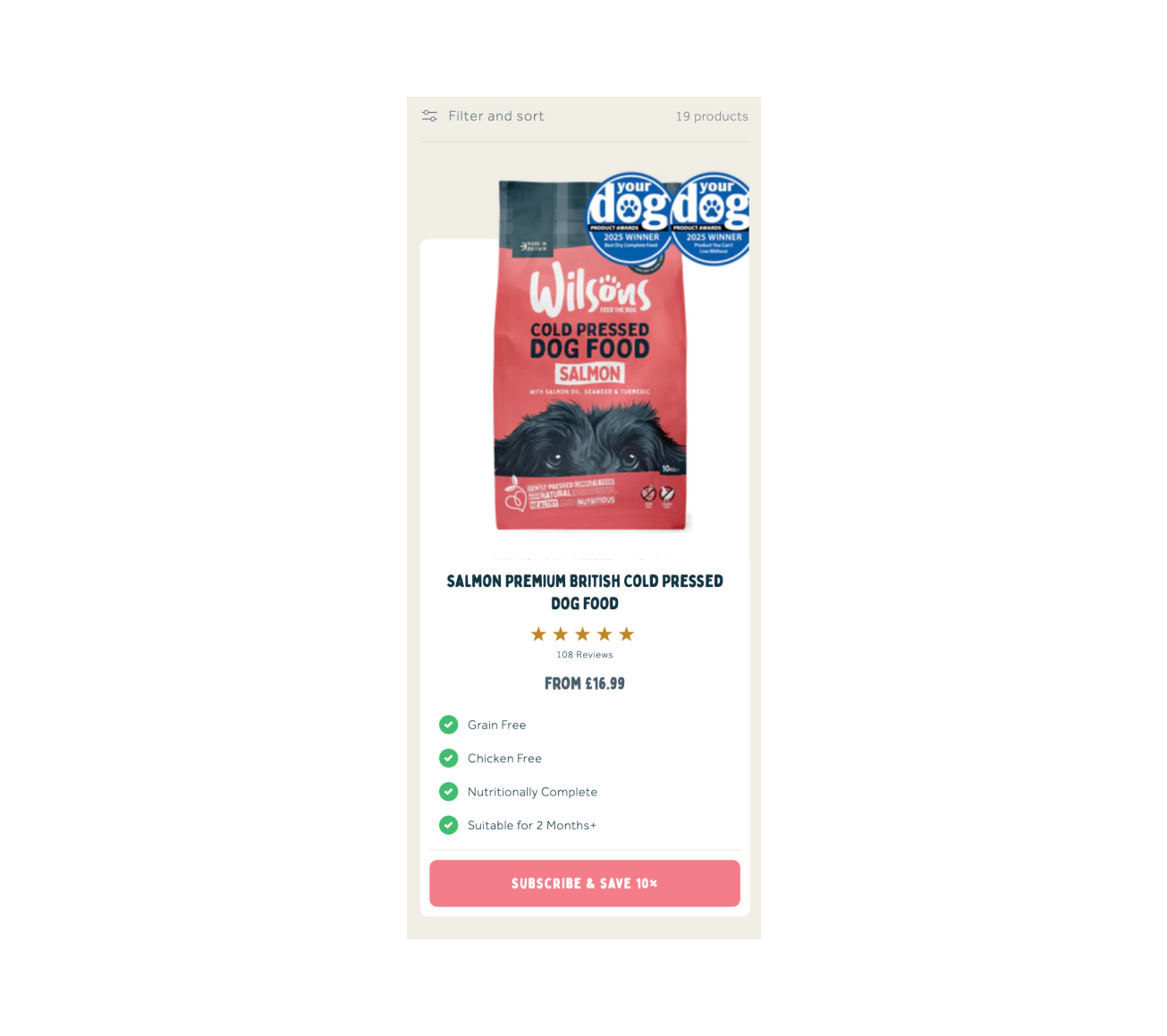
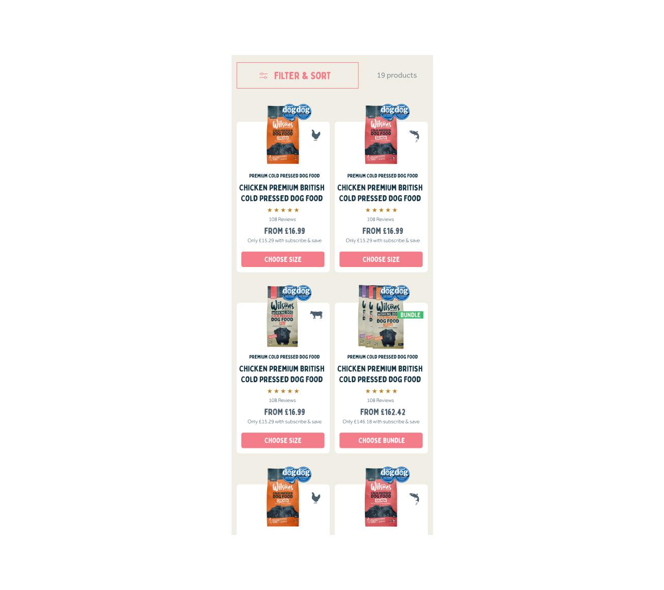
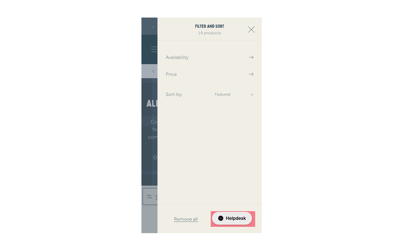
By redesigning product and catalog pages, streamlining navigation, and enhancing mobile functionality, we created a modern, user-friendly platform for Carolina Restroom that simplifies access to essential information and drives customer engagement.
Crafting a captivating design for a WooCommerce watch store posed a challenge. Learn how we achieved this, enhancing both aesthetics and functionality seamlessly.