Popups serve a variety of functions to grow your business. There is a range of different goals your business and therefore a popup can have.
Let’s check the most popular ones.

Do you want to boost your eCommerce revenue? Why not try eCommerce popup best practices as an additional channel to drive conversions and sales?
For sure, popup advertising ads get a bad rap: A lot of people think that popup display ads are dead.
I know that we all had a bad experience with popups. For sure, they can be so annoying/old-fashioned/insulting/irritating, but… The answer to “Do pop-ups work?” isn’t “No.”
But as annoying as they can seem, they’re still perfectly effective in converting more traffic. Business owners are still benefitting from popups because they work and deliver good results.
If popups suck, many of your favorite sites won’t be using them.

But, popups work only when done right.
Today we’re going to look at effective ways and best practices to use popups on your website, with real-world examples.
Table of contents:
⤷ Why should we still use popups in 2021
⤷ How popups work: best practices to follow
⤷ Wrap-up
Depending on your website, popups can be used to achieve a variety of goals:
Popups are a convenient tool to drive more sales using well-known marketing techniques such as up-selling, cross-selling, and cart abandonment reduction.
For eCommerce websites, popups can be timed around an “exit intent” in order to promote a last-second offer to re-engage your visitors.
Email marketing is still considered the number 1 way to turn visitors into buyers. But before you can actually send emails, you need to build your email list. And pop-ups are the best ally.
Growing your email list is a tricky task that just became even harder under the European GDPR regulation.
[Source: Adoric]
And, using popups you can try to encourage visitors to opt-in by offering a discount or a giveaway in exchange for an email address, for example.
When you have customers’ email addresses, you can always reach out to them to buy your product.
Actually, no matter how good your product is, how great is your popups strategy, or how many coupons you offer. It’s because some visitors are simply not ready to buy. All you need is just to accept it.
Have you heard about the 3/47/50 rule? It says that:
All you need is just to accept it, that half of them will never buy.
At the same time, you should target the 47% of visitors who aren’t ready to buy immediately. A healthy email list contains visitors who are actually interested in your products. To segment your opted-in customers’ list and target them properly you may use popups.
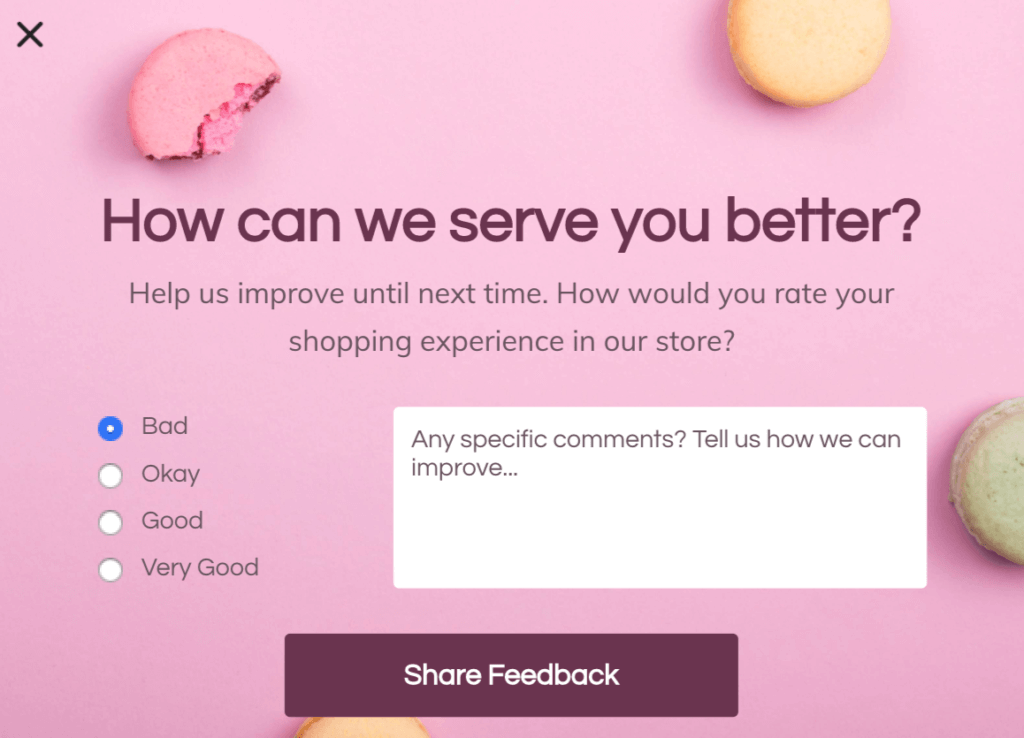
Although they weren’t specifically created for purpose of getting feedback and improving user experience, popups can play a great role in doing that.
You can instantly generate feedback for your eCommerce or services while analyzing real-time data in order to run further optimization tests based on your discoveries.
[Source: Sleeknote]
As we can see, popups can be good.
Who wouldn’t want all of that? When done right, website conversion popups can be extremely beneficial and effective.
- Statistics
- The average popup conversion rate was 3.09% in 2020 (A 3% conversion rate may not sound that impressive, but 3% of every website visitor becomes a significant number over time.)
- Sometimes popups can convert up to 40% of your website visitors into subscribers and leads.
Why are pop-ups so powerful when so many people complain about them? There are a few key reasons:
[Source: Unbounce]
Whether or not your popups campaign will succeed will depend on many factors including your website content and your personas.
Please don’t assault your customers with neon, ALL CAPS, and non-existent prizes. Nobody has time for bad pop-up design (and no one will join your email list either).
When done right, popups can be extremely effective.
Are you wondering what a “done right” pop-up even is?
There’s no shortage of tools to choose from. But we have chosen Sleeknote for ourselves.
Some time ago, we hold a live webinar with Sleeknote CEO – Mogens Møller, where he shared the popup best practices and scenarios based on the popup research with data from 10 279 153 157 visitors.
Popup Best Practices 2021 for eCommerce [Webinar with Sleeknote]
One of the negative implications of popups is the assumption that they all have to excitedly (and literally) POP UP.
This is false. There are multiple different popup best practices you can use that aren’t intrusive, and that is way more effective at lead generation and conversion than a pop-up so aggressive that you can almost hear its visual presence screaming at you.
If you also believe that popups still deliver good results, check out these popup advertising best practices that are likely to help you drive the extra conversions in 2021:
Pop-ups have a variety of components to them. Each component requires individual attention. You’ll spend more time on some of them will take more time, while you spend less on others before you understand which pieces require the most effort, with time.
Among them:
Perhaps the most important rule to running an effective popup strategy is: always to provide value to your audience.
“What’s in it for me?”

[Source: Personizely]
You don’t just want to ask people for their email addresses. Give them something of value, not something that even you yourself wouldn’t want.
Creating and displaying pop-ups that don’t deliver any kind of useful information or value to your visitors is extremely risky.
If you don’t have a good offer, it won’t be persuasive enough to get your visitors to subscribe (it doesn’t matter how beautiful your popup is). Your offer must be unique, relevant, and exciting for your visitors, and most importantly, sufficiently valuable to for them to provide their information in exchange.
Context is what makes a pop-up effective, or a pop-up “done right.” According to Gary Vaynerchuk, “Content is King. Context is God.” And according to Sumo research, the best pop-ups with good context have conversion rates of over 40%.
Pro Tip #1: Don’t provide an irrelevant offer in your popup > Segment your popup
You can’t communicate the same message to visitors at different stages of the buying process. It’s better to push your sales messages (including free shipping offers, discounts, etc.) to visitors in more advanced stages (those who are already considering buying a solution for their needs), and promote your free giveaways (or even sign up for a free trial) to early-stage visitors.
In addition, you need to be mindful that you display your popups only on relevant pages. In this case, segmenting your popups means creating relevant messages that match the content on the landing page.
Here’s a simple example: if you provide a free case for each tablet, you shouldn’t promote this offer on the product pages of washing machines. You should set this offer to only appear on tablet-related pages.
Tip: Try to create exclusive offers to be presented in your popups, most importantly, that aren’t available elsewhere on your site.
Tip: Don’t repeat the offer promoted on your main page banner.
Tip: It’s very important to focus on only one offer in a popup.
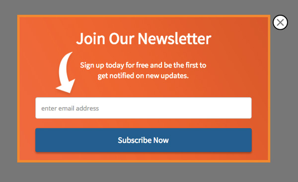
Pro Tip #2: Don’t place too much text in your popups
Don’t exaggerate with text, because distraction also kills conversions. Always keep in mind: ’Less Is More’.
Would you really want to click on a popup with a dull headline? Your headline is what pulls people in.
The headline is the first impression, and one that is confusing will all but guarantee you won’t be seeing that person again. “Sign Up for Coupons” differs from “Receive Our Emails”, cause it is more clear.
Microcopy is a small, unobtrusive piece of text near your CTA button that allays the fears some people might have of interacting with your popup. For example, if you have an email lead generation popup, a natural fear that most people will have is “I don’t want to get spam emails”.
Using microscopy, you can eliminate those fears by saying something like “We won’t ever share your email and we’ll only send you X emails per week”. That way, people know exactly what they’re getting into.
[Source: eMarketer]
If you want your popup to catch people’s eyes, you’re going to need good graphics to capture attention.
While you don’t want to overwhelm your visitors with clashing colors, you do want to use color to grab their attention and focus. Bright colors are eye-catching. Think of how red, orange, and yellow instantly grab your gaze.
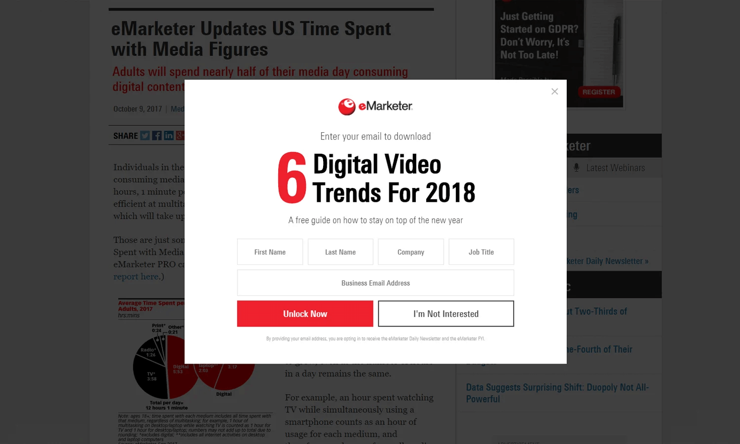
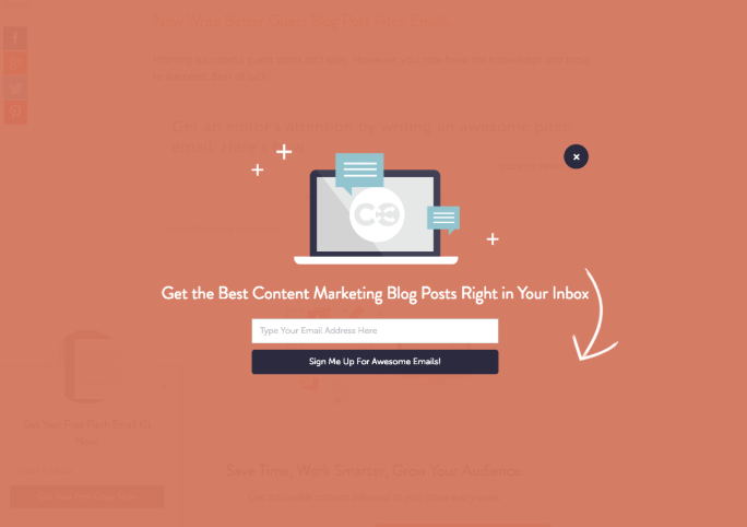
Pro Tip: Match the rest of your site and personalize when possible
When you design your popup, you want it to feel like it’s a part of your site, rather than an intrusion.
The way to achieve that is your popups must be designed to fit with the style, colors, and typography of the rest of your site. As if it’s not a popup, but instead another ‘layer’ to your site. For example, eMarketer (sample above) uses the website’s red-black color scheme on the popup and it looks great.
Personalization is the idea of matching your popup’s content to the content on the page on which it displays.
So rather than having one site-wide popup, you might create different popups, each tailored toward a specific part of your site or category of content.
When it comes to popups, most people think that to convert more visitors, you just need to display a powerful message. For sure, we know that killer headlines catch visitors’ attention, that visitors can’t refuse a lead magnet offer or that only a powerful message can make them sign up to your list.
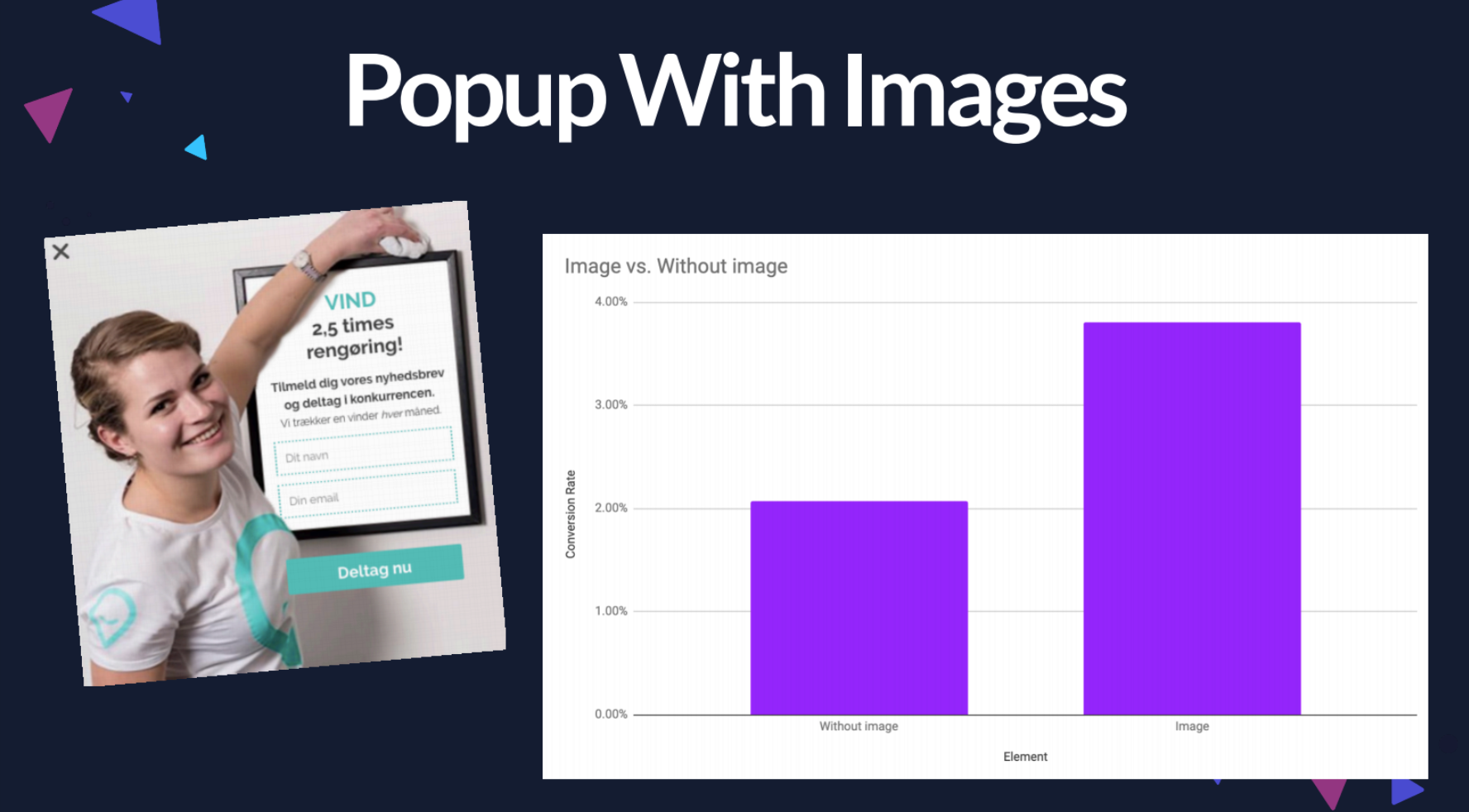
But if you think that’s all you need, you’re wrong! We may underestimate the influence of visuals.
We all know images can increase conversions. Popups are not the exception. Visuals affect your visitors’ willingness to avail of your offer as much as other elements on the popup.
According to Sleeknote research, popups with images (3.80 %) convert better than popups without (2.07 percent) by 83.57 %.
Pro Tip #1: Use visual cues to guide visitors to your key message.
All human beings can’t resist following the gaze of other people. We have been coached since birth to follow arrows directing us to where we should be looking and going.
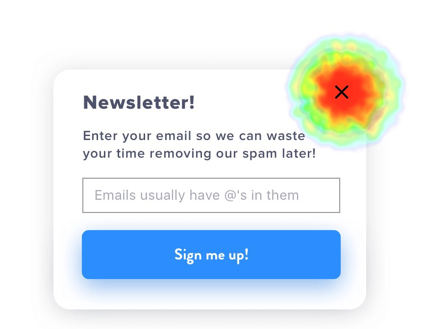
Consider the following eye-tracking heat map example of eye direction cue:
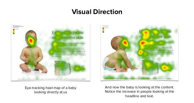
As you can see, on the right image, users focus their attention on the baby’s face again and directly follow the baby’s line of sight to the headline and opening copy.
- Recommended reading
- How to Use Visual Cues in E-Commerce (+ 8 Examples) — Sleeknote
You can target the same behavior on a popup: If you’re featuring images of people on a popup, have them look towards your headline of any other element you want a visitor to see.
At the same time, keep in mind, that according to ConversionXL, the effect “people do look where others are looking” varies by gender and even political temperament.
So, you should try using images with other elements that serve as visual cues for where visitors should look next. For example, classic explicit arrows or linear cues.
Nobody knows what will work 100% in your case, you should test different options yourself.
Pro Tip #2: Use video.
In fact, adding videos to your popups could help you boost engagement beyond belief. Sometimes, if coupled with a strong headline and a pushing CTA, videos can help get visitors to consider buying your product or stop those who leave your website.
Pro Tip #3: Use photos with people.
It’s not duplicating the tip “Use visual cues to guide visitors”. Now, we’re talking about using photos of an actual person to make more people trust your message more. Live photos work, cause they help us connect emotionally with the other person.
Pro Tip #4: Use actual images of a lead magnet or something specific you offer a discount on.
OK. Thank you, Captain Obvious! That sounds like common sense!
However, in practice, you definitely have seen popups featuring an icon, a generic image, or another visual irrelevant to the product. So, try to use real product photos and visitors are most likely to click on the popup.
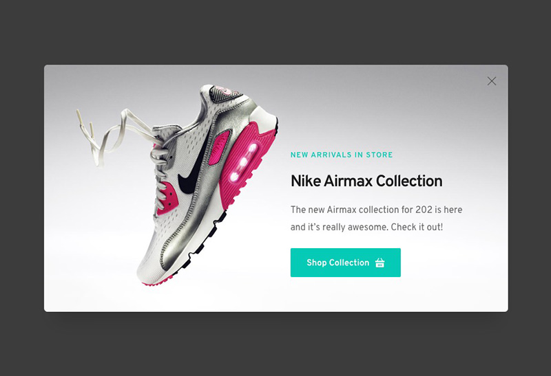
If it’s not a product, but a learn-how guide or specific online training, show your potential client the outcome of using the resource you’re promoting.
Pro Tip #5: When it comes to visuals, mobiles should be treated differently
As the bandwidth available to mobile visitors is almost 3 times lower, visuals on mobile popups may just take too much time to load.
Do fewer fields really mean fewer conversions?
In general, it can be said that the less information you ask for, the more visitors will opt-in.
At the same time, requesting more information (e.g. gender, first name, age, etc.) allows you to send more customized messages and offers to your subscribers.
Sleeknote found that popups with 2 input fields convert better than popups with 3 input fields and even better than popups with 1 input field.
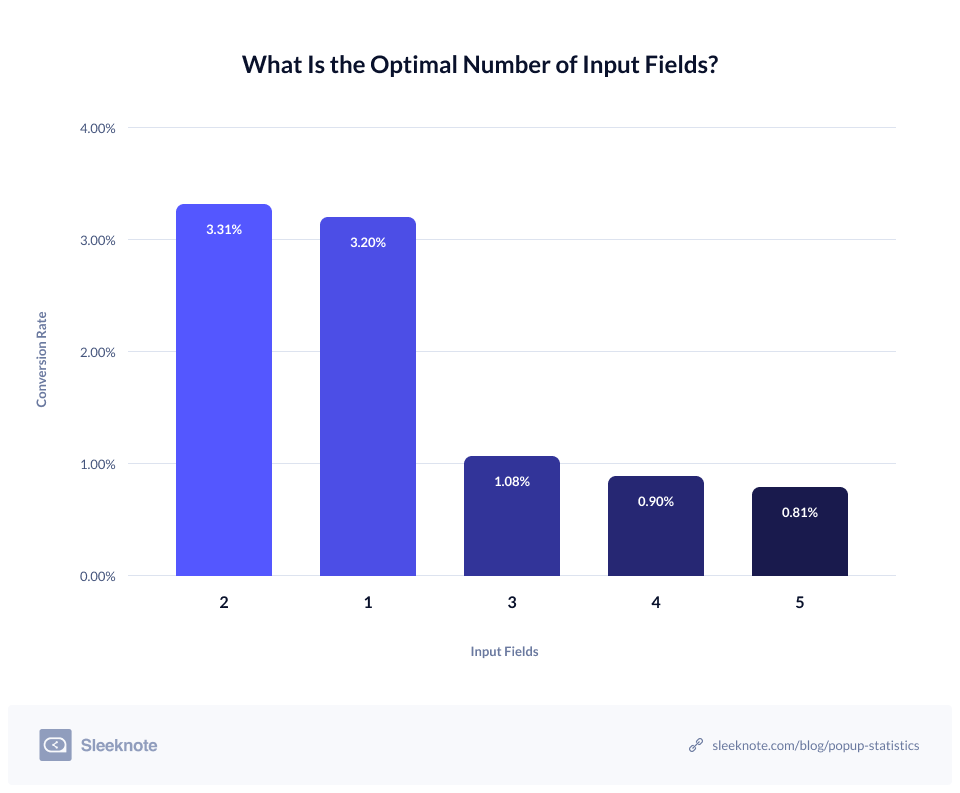
If you’re using 5 input fields, consider limiting your popup to 3 fields (e.g., first name, last name, and email OR telephone number). Or, if essential, add the remaining two fields to the second step of a Multistep popup (see #4 below).
Pro Tip: The less is more!
For one-step popups, where the form can be found on the first popup, whether it is an exit-intent popup, time-based or scroll-based overlay typical best practice is to request only the email address.
For multi-step popups, when the visitor only clicks on the first page (e.g. YES/NO popup), you can ask for more information.
Multistep popups are ideal to collect more visitor information without hurting your conversion rates.
This is what your multistep popup could look like:
Step 1.
As you can see below, the visitors’ email addresses are requested only.
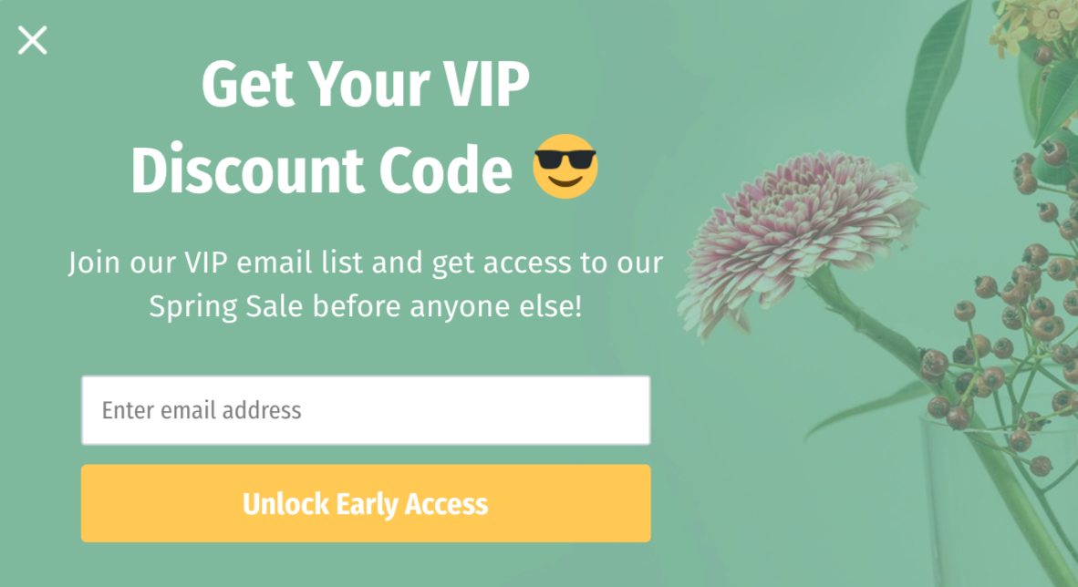
With such a popup, you can grow an email list with subscribers who are ready to hear more about your offers.
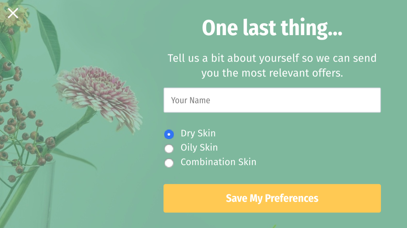
If you want to segment your new subscribers to target them with more relevant offers, you could use Step Two to ask for more information (gender, location, interests, or skin type, as in the below example):
Step 2.
[Source: Sleeknote]
After the first popup raises your visitors’ interest, they’re more likely to provide their contact details (e.g. first name, last name, company name, telephone number, etc.) when you place more input fields on the second page. But it’s very important to use at most four input fields – more fields will reduce your chances for conversion.
According to Sleeknote research, popups that have a second step see a staggering 76 % of their subscribers input more information.
What does this mean for you? Well, with that many subscribers inputting data in the second step, there’s a great opportunity to enrich your lead data – without adding more fields or, most importantly, seeing a dip in conversions.
If you want to bring your popup design to the next level, we recommend you experiment through continuous AB testing. Start with the obvious (formats, positions) and progress until you’ve tested every element of your popup.
Remember the last step of the signup process?
Take action!
To drive people towards performing the action, you must make sure your call-to-action (CTA) is visible.
So, don’t be afraid to get a little bit more creative with your CTA. For example, if you’re driving traffic to a sale, something like “Get a discount” is more enticing than “Visit sale” because everyone wants a discount, right?
Pro Tip #1: Use contrasting colors for your CTA
Contrast takes a user’s attention and focuses it on what matters while allowing less important elements to remain in the background.
A compelling CTA isn’t just about the text, it’s also about grabbing your visitors’ attention in other ways. Namely, color.
To do so, we recommend using a color that contrasts with the rest of the pop-up.
[Source: Sendpulse]
NOTE: Marketers ran a multivariate test comparing 12 different CTA’s against each other to determine which one would convert best. Not surprisingly, the CTA with the highest contrasting headline and subheading converted 60% higher than the other less contrasting variations.
Pro Tip #2: Play with language changes
It’s obvious that design and imagery can affect how well a page will convert. However, the nuances of language also impact a person’s psychology. Sometimes, small language changes can often have overwhelmingly powerful results.
For example:
– Changing “Your” to “My” in a CTA since it represents the first-person statement;
– Adding “Now” to a CTA, as it adds an element of immediacy;
– Simply by changing one word you can get a solid increase in click-throughs on CTA (changing “Request a quote” to “Request pricing” caused a 162% increase only because “pricing” is clearer as to what a user is requesting).
Pro Tip #3: Be careful with links
If using a popup aimed at sending traffic to a lead generation landing page, always send visitors to a relevant, email-gated landing page.
As a visitor, being stuck with a pop-up that you can’t close is a frustrating experience (I believe we’ve all been there).
To improve user experience, you have to make sure your popup includes a way to close the popup. Sometimes the pop-ups are inconvenient, that’s why you need to allow the user to dismiss your pop-up easily.
Feature the “x” or “no” button clearly or allow people to click off the side of the pop-up to close. Don’t hide the exit option.
[Source: UXDesign]
Pro Tip: 3 seconds delay
Best practices show that the delay of the close button shouldn’t be more than 3 seconds – after 3 seconds it becomes very annoying.
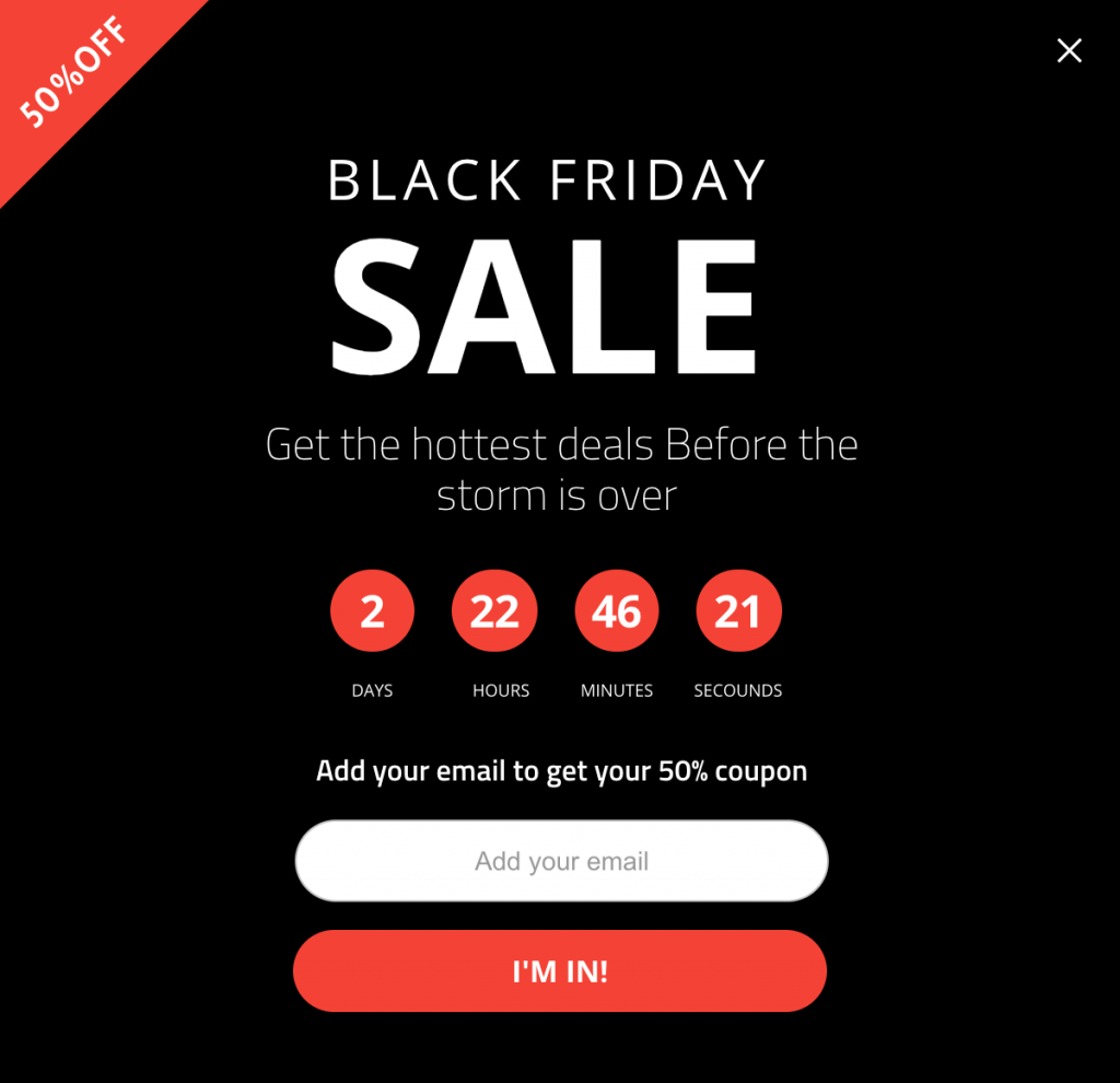
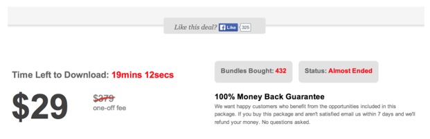
One of the most powerful psychological elements of all is urgency. Urgency is the reason why people line up overnight to get deals on Black Friday.
Time is what puts that fire underneath a user by subtly telling them that if they don’t act right away, then what’s being offered will be gone forever.
According to an A/B test from Marcus Taylor on ConversionXL, the countdown timer boosted conversions from ~3.5% to ~10%. And it happens to be a 332% increase.
Variation A:
Variation B:
[Source: ConversionXL]
The most effective form of time-based urgency is usually accomplished with a countdown timer. The reason being is that a countdown clock clearly shows a user that the longer they wait, the less time they’ll have to act.
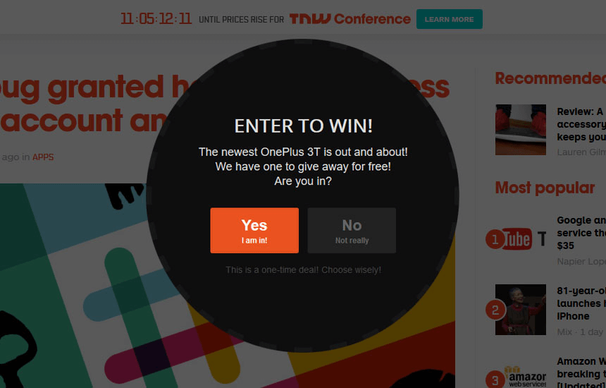
Take a look at this example of time-based urgency being used via a countdown clock on the giveaway:
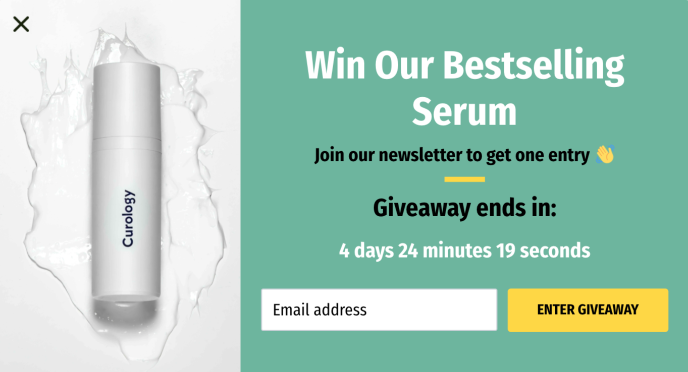
[Source: Sleeknote]
And pop-ups (especially in the form of scrolling header or opt-in bars), are the best way to add that urgency.
- Recommended reading
- 11 Unique Countdown Timer Popup Examples (+ Templates) — Sleeknote
Countdown timers, embedded within scrolling header or footer bars, don’t interrupt your visitor’s ability to interact with your website. They simply remind them that what you’re offering won’t be around forever and they need to engage or they’ll miss out.
If something is rare or unattainable, we want it more.
Scarcity is the phenomenon where, when a product or service is limited in availability (or perceived as being limited), it becomes more attractive.
One of the most well-known scarcity studies was conducted by Stephen Worchel in 1975. He and his colleagues offered the subjects cookies in a jar. One jar had 10 cookies, and the other jar had two.
Subjects preferred the cookies from the jar with two in it, even though the cookies in both jars were identical.
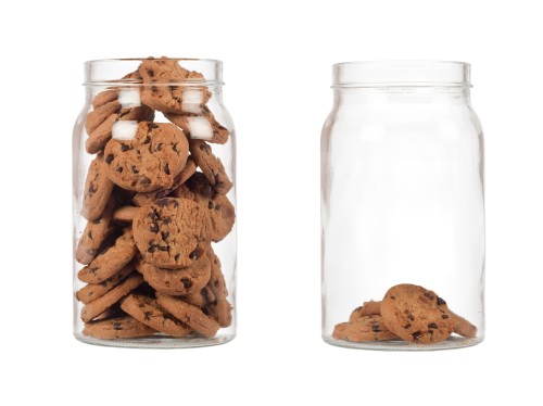
Since then, much research has supported the efficacy of scarcity in the marketing world as well.
Why is this? Much of it comes from the fear of missing out (FOMO).
- Recommended reading
- 34 Clever Scarcity Examples to Skyrocket Your Conversions — Optimonster
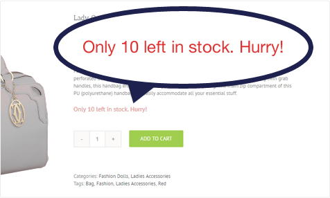
The main driver of scarcity is your stocks. If your shoppers know that a product has a very low inventory, they are more likely to purchase it immediately thinking that anytime soon the product will likely sell out.
Websites use scarcity to encourage users to book or lose out on an awesome deal / buy or miss an awesome product.
[Source: XLPlugins]
Pro Tip: Be careful with scarcity sales triggers!
Scarcity doesn’t always work, though. If people have a higher knowledge of persuasion tactics or more exposure to scarcity claims, they’re less likely to value a scarce product more.
- Recommended reading
- Shopify Cracking Down On Fake Scarcity? — Medium
To sum up, if scarcity is a business strategy — and your customers are smart — it’s gonna hurt more than help.
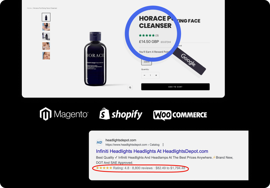
As humans, we are by nature social creatures. Because of that, we’re constantly trying to adjust our behavior to align with what’s socially acceptable in any given situation.
This is the same reason that people so frequently visit review sites before trying a new restaurant, or why people will enlist the help of their friends before booking a trip.
Marketers can take advantage of this phenomenon by using social signals to their advantage by adding testimonials, reviews, and positive ratings that can help influence a user’s decision-making process.
→ Informational Alert. Information alerts let users know something about your company. It can be purely informational like changing your store hours, free shipping, any season sale (e.g. BFCM), upcoming webinar or any information that leads to a call to action.
→ Page redirect. Page redirects will take your visitor to a related post or product page. These campaigns are great for increasing page views on your website by redirecting readers to related content.
→ User login. User login popups are perfect for improving the user experience.
→ Survey form. With a survey-form popup, you can learn more about your customers and thus personalize your marketing campaigns or improve your product.
→ Lead magnet download. Lead magnets are something that your audience will find valuable. You can offer a content upgrade, ebook, or exclusive content. For this one, it’s incredibly important that you offer something relevant. Here’s a list of 69 lead magnets from Optinmonster you can use if you’re struggling to find ideas.
→ Webinar registration. A webinar registration popup is a great way to get more attendees to your event.
→ Pre-order signups. A great way of increasing overall sales is to start taking pre-orders. With a pre-order popup, you can introduce your new product to visitors.
→ Coupon Code/Promotion. Want to grow your contact list and make your customers happy at the same time? Show them a coupon code or promotional popup. If you’ve got a special offer most of your site’s visitors will be interested in it.
For example, you can suggest a first-time buyer discount.
If a visitor is interested in buying something in your store and there’s a, let’s say, 10% discount available, he is likely to want to know about it.
Moreover, it is effective because it delivers relevant value when the website visitor wants it and 10% off most products is worth his email address.
You can get creative by making and adding a video to promote your special offer.
→ Email opt-in. Building an email list is the most valuable thing any digital marketer can do. One of the ways to do that is through popups. These popups are designed to get a name and an email address. That’s it.
→ Product recommendations. As your customers are browsing certain product pages, a popup appears with another item that they’ll find interesting. It’s a good way to increase the overall amount your customers spend.
+ Product upsells: popup will show the items more expensive than those the customer is currently looking at or purchased already.
+ Product downsells: popup will show customers a less expensive offer than they previously looked at.
→ Giveaway popup. Such types of popups can help to grow your email list, attract warm leads or generate more paying customers. People will want to participate in your contests and giveaways because it costs them nothing other than giving you their email addresses as they are about to leave your website.
Here are some actionable giveaways that can be used to persuade your visitors to sign up:
→ Countdown timer. We mentioned such a type before while talking about sales triggers. Countdown timers are perfect for creating a sense of urgency with your customers.
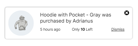
→ Recent activity notification. Such pop-ups are a powerful form of social proof for your website because let users know when someone is interacting with your brand online. They build instant trust with your audience.
→ Recent sales notification. These popups show when someone purchases a product on your site in real-time. This leverages the marketing tactic known as FOMO (fear of missing out).
The modal popup is probably one of the most used.
But still, there are quite a lot of pop-up formats. Don’t be afraid to experiment with them to pick the right one in your case.
For example, you can try notification bars or slide-ins to still drive action without requiring a modal interaction.
[Source: OptinMonster]
These terms are used somewhat interchangeably. Some even call them out separately from “popup.” Nevertheless, they are a type of popup.
And it works, as it has prominently shown when displayed on top of an overlay that blurs or dims the background and is positioned at the center of the screen.
- Recommended reading
- Pop-Ups, Overlays, Modals, Interstitials, and How They Interact with SEO — MOZ
Here’s a great example from Coschedule.
These might remind you of aggressive popups, but don’t sell them short. You’ll see these sliding into view typically from the side or bottom of a page.
These pop-ups, as their name suggests, are displayed on the side of the screen. They’re non-intrusive, which means you can use them on landing without any risk for your conversion rate. We recommend them if you worry pop-ups could degrade your user experience.
MadMimi analyzed a heat map test and noticed that slide-in subscribe leads had a much better conversion rate than any regular pop-up.
You land on a page. A message pops up, then stays up. Forever (or however long you are on that page). They are often stuck to the bottom or side of a page and will follow you wherever you scroll.
This style element of a pop-up can ensure that it won’t be missed, but be careful with the design. No one wants a footer that they can’t get rid of which cuts off a quarter of the page.
Any of these pop-up types can be triggered by one of the following:
Displayed on top or at the bottom of the page, they provide a subtle invitation to sign up. If they don’t take too much screen estate, you can display them over a few pages of the same session.
These pop-ups are preceded by a CTA. The modal itself won’t show up until the user clicks the call-to-action. They’re particularly adapted to mobile screens and are your best option on these devices.
Moreover, as they take limited space, you can display them on every page of your website which increases your chances of converting your visitors.
And they are really cool because they’re seen by users who are interested in what you have to offer. That means you’re getting super warm leads to these campaigns.
To be effective, you should choose the right pop-ups for your audience / for the right use case.
There are many types of popups that are more or less efficient depending on your strategy. In fact, some industries require more aggressive practices than others: it all depends on your marketing personas and price range.
Here are the 6 main types of pop-ups that you could use:
- Statistics
- Well-designed and properly timed pop-ups can lead to conversion rates as high as 60%
Delayed pop-ups are triggered after a visitor has spent a certain amount of time on your website.
While timing isn’t a part of popup design from an aesthetic perspective, it’s still one of the cornerstones of creating an effective website popup.
If your popups appear too soon, they will be annoying and disturbing, because they will interrupt your visitors. If your popups display too late, you can lose a lot of new subscribers.
The problem for many brands using popups, though, is knowing when to set the trigger. So what’s the best timing? 5 seconds? 10 seconds? Or even 30 seconds?
Sleeknote found that popups that are shown after 8 seconds convert better than popups shown before or after.
But, generally speaking, the best timing varies site by site (20 seconds could work, or 40 seconds could work better). The popup should only be triggered when a visitor has sufficiently understood your website.
A visitor came for a reason, and it wasn’t your pop-up. So, don’t be immediately in his face.
Pro Tip #1: Set the timing to 60% of the average time spent on site.
Pro Tip #2: Try to experiment with the 60 seconds delay.
Try to take the Unbounce suggestion into consideration and use the delay should be 60 seconds. According to Unbounce, if your visitors have spent 60 seconds browsing your website, they have already shown an adequate amount of engagement and presumably they understand the main message of your site – and 60 seconds isn’t so much time that you lose a lot of potential subscribers.
One of the reasons some popups don’t work is that they interrupt visitors at the wrong time, alienating them forever.
Scroll-triggered popups are the most polite way to engage your users as they scroll. They help to reduce bounce rate, and abandonment, increase visitor retention, and drive more conversions.
Scroll-triggered popups give you the ability to market specific material to specific users when they scroll down to a certain point on the page, and you can tailor that point to meet your exact needs.
In other words, they help you get more value from your website while creating a great user experience for visitors.
However, much like a Timed Trigger, it’s hard to know when to set a popup to show.
According to Sleeknote, showing popups is when a visitor scrolled 37% percent of a page convert better.
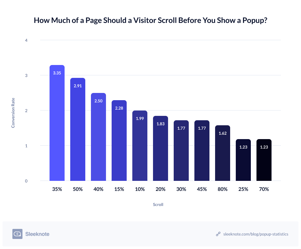
Again, it’s just statistics and the popup’s conversion rate will vary from page to page and website to website. For sure, your case might be uniques and it would be better to test different scenarios for a while and choose the most effective one. Just take your time!
But if you’re starting from scratch, setting a Scroll Trigger at 35% is more than a going starting point.
Pro Tip: Give people a chance to catch their breath before sending pop-ups into action.
MadMimi analyzed a heat map test and noticed that their slide-in pop-up box converted best for them at approximately 80% scrolled down the page. So, don’t hurry up by showing your popup.
You can show a popup when a visitor views your FAQ articles and then returns to a product page for example, or visits a certain number of pages in one session. Show your popups at these times, and you’ll be helpful without hurting the user experience.
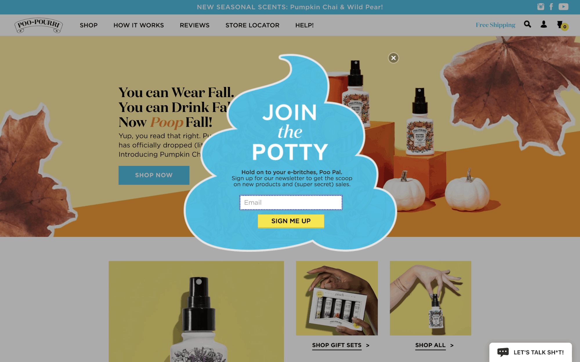
These are popups that are triggered at the moment your visitors land on your website. Although they might work in some cases (language selection, age restriction, disclaimer, exceptional offer, major news…), they’re generally not happily welcomed by your visitors because of their intrusive nature.
Interaction-based pop-ups are triggered once a visitor has clicked or hovered over a specific element. Basically, they allow your team to create a personalized experience based on your visitors’ behavior.
Well-designed and properly timed pop-ups can lead to conversion rates as high as 60%
- Statistics
- 70% of people who visit your site never come back.
- WPBeginner increased their subscribers by nearly 600% with an exit intent pop-up?
The last thing you want is for someone to visit your site and leave before they convert. That’s why you need exit intent pop-ups: Exit-intent popups can boost site retention and increase your conversions.
So, an exit-intent popup displays when a visitor is about to leave your website.
Exit-intent popups are famous in the eCommerce industry as an effective tool to reduce cart abandonment rates. They can also be used to generate leads or collect email addresses.
Pro Tip #1: With an exit-intent popup, you can reduce your shopping cart abandonment.
It’s no secret that shopping cart abandonment is a huge problem for eCommerce business owners. In fact, cart abandonment accounts for over $4 trillion in lost sales each year.
You need to do everything you can to get prospective buyers to stay on the checkout page.
Here are the most frequent reasons an online buyer might abandon a shopping cart:
Actually, if visitors have added your product to their carts, it means they are interested in buying.
Showing an exit-intent popup to promote discounts as the prospect is about to leave your website will help you generate more sales.
Pro Tip #2: At first, ensure you’ve dealt with other reasons shoppers abandon their carts online before.
Asking visitors to wait as they are about to leave your website is an effective tactic smart digital marketers are using to boost their revenue.
Pro Tip: Prepare a specific design for mobile
For example, you can try notification bars or slide-ins to still drive action without requiring a modal interaction.
[Source: WisePops]
The first motivation for keeping separate campaigns? Google’s Mobilegeddon mentioned above.
It makes sense to create separate campaigns for UX reasons as well.
Popups are ugly, intrusive, and above all, hurt the user experience…
But only if you ignore the best practices outlined above.
For many years, big brands and small businesses have been using popups to grow their email subscribers. It’s because it works.
When it comes to keeping visitors on your site and driving them back to your offer, exit intent pop-ups are one of the best ways to capitalize on the fact that the visitor is already on your site.
The popup practices in this post have shown you how to optimize your eCommerce popups for maximum conversion.
And keep these effective strategies in mind when creating your popups:
I hope, finally you have a better idea of why pop-ups work and how to implement them effectively.
Now it’s time for you to make the changes, or get started with your first popup.
- Do you want to increase your conversion rate right now? Audit your site today to improve engagement for your audiences!
Pro Tip: Thoughts people have vs. the actions they take are two totally different things
Sometimes, your customers’ behavior shows every indication of converting but then they don’t.
And this can certainly impact your conversion rate. But it doesn’t mean your conversion rate is dead.
All of your marketing efforts – including emails, pop-ups, and ads – may not work immediately, but it doesn’t mean they don’t stand a chance at all, especially if they are well-created and offer an incentive.
Thank you for reading!