When it comes to ecommerce, getting people to your site is no longer the biggest challenge – turning those visitors into loyal customers is. That’s where the power trio of UX (User Experience), UI (User Interface), and CRO (Conversion Rate Optimisation) comes into play.
These aren’t just industry buzzwords. They shape everything from first impressions to purchase decisions.
During our last Ecommerce Camp Birmingham 2025, our UX/UI expert, Adam Forshaw, led a roundtable discussion on UI/UX design. Here is the presentation for your review:
Let’s break down what they are and why they matter more than ever.
UX, UI & CRO: What Do They Mean?
🎨 The User Interface (UI) is all about how your site appears. It’s the visual design – colours, layout, typography, and everything users see on the screen.
🧠 User Experience (UX) is about how it feels to use your site. It’s the ease of navigation, the clarity of content, and the smoothness of the user journey.
📈 Conversion Rate Optimisation (CRO) focuses on how well your site turns visitors into paying customers. It’s the science (and art) of making every click count.
Why These Three Matter in Ecommerce
A small change can have a big impact. For example, every 1-second delay in page load can reduce conversions by up to 20% – yes, twenty percent! (Google)
Moreover, 88% of users say they’re less likely to return to a site after a bad experience. (Amazon Web Services)
But here’s the good news: Good UX design can increase conversion rates by up to 400%. (Forrester)
As acquiring traffic becomes more expensive, CRO becomes one of the smartest ways to maximise ROI from your existing visitors. Why keep spending on ads if your site isn’t converting well?
Stats:
Positive user experiences directly impact conversion rates. Investing in user experience (UX) pays off – studies show that every $1 spent on UX design can return up to $100. Yet, UX still receives just 20% of the average software development budget.
Also, keep in mind that first impressions are 94% design-related. So, if your UI and UX are off, users won’t trust your brand or stick around long enough to convert.
The Untapped Potential of Your Traffic
The average ecommerce site converts only 2-3% of its visitors. That means a massive 97% of people leave without buying. CRO helps unlock that remaining potential.
For instance, if your site receives 150,000 visits and converts at a 4.66% rate, you’ll generate approximately 7,000 orders. Increasing your conversion rate by just 0.4% could result in 500 extra orders. With an average basket value of £45, that’s £22,500 in additional turnover – from just a tiny change.
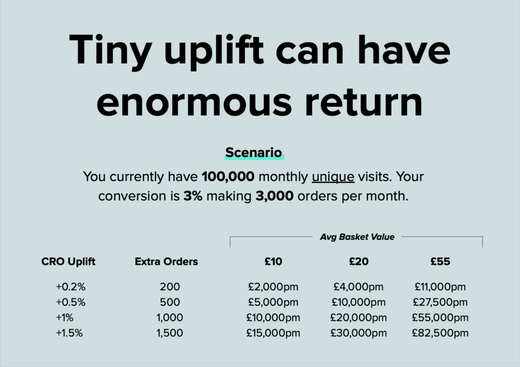
Let’s run a typical scenario:
You have 100,000 unique visitors per month.
Your current conversion rate is 3%, so you make 3,000 orders.
Now apply CRO:
+0.2% = 200 extra orders
+0.5% = 500 extra orders
+1% = 1,000 extra orders
+1.5% = 1,500 extra orders
Depending on your average basket value (£10, £20, £55), that uplift could translate to £2,000 to £82,500 per month in extra revenue.
Common Mistakes That Kill Conversion (and How to Fix Them)
Even the best products won’t sell if your site drives users away. Here are some of the most common mistakes that damage conversion rates – and what to do about them:
1. Slow Load Times
Over 53% of users abandon a site if it takes more than 3 seconds to load. That’s more than half your potential customers gone.
✅ How to fix:
Run page speed tests.
Optimise imagery.
Minify your code.
Choose fast, scalable hosting.
2. Overwhelming or Confusing Navigation
Not all navigation is created equal. To truly support your shoppers, your e-commerce navigation must deliver the right information quickly – without overwhelming users with too many choices.
More choices lead to more indecision. If your navigation is chaotic, people get frustrated and leave.
✅ How to fix:
So, how should you structure your site’s top-level menu? Effective ecommerce navigation typically follows a few key principles. Let’s explore them through an example.
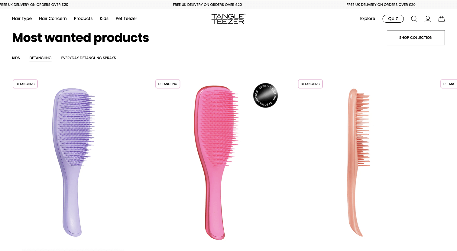
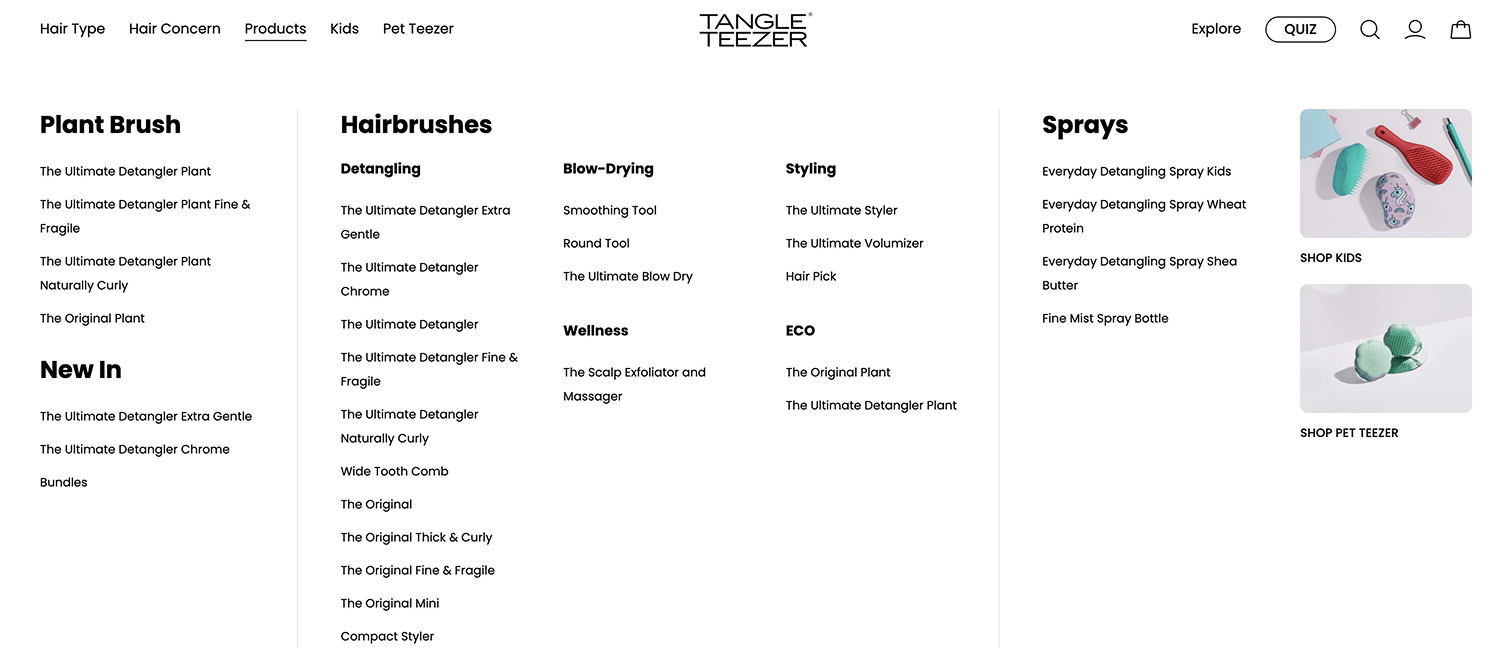
🛍️ Example: Tangle Teezer
Highlight your bestsellers. Your most popular products often drive the most revenue, so help shoppers find them easily. Many successful brands dedicate a full menu item to “Best Sellers” to guide traffic to their highest-converting products.
Use clear categories and subcategories. Organise your navigation with broad parent categories that branch into dropdowns. This structure helps users dig deeper into what interests them without getting lost.
Make the cart button impossible to miss. The shopping cart should be visible at all times. Placing it prominently in your navigation ensures shoppers can check out from any page—reducing friction at a critical moment in the purchase journey.
Include a clickable logo that links home. The homepage acts as your digital storefront. A clickable logo in your top navigation lets users quickly return home, no matter where they are on your site.
Optimize your anchor text. Navigation links should use clear, descriptive, and keyword-rich text. This not only improves the user experience but also boosts your SEO, increasing the chances that your category pages rank in search results.
In short, great ecommerce navigation blends usability, conversion strategy, and search visibility—all from the top menu.
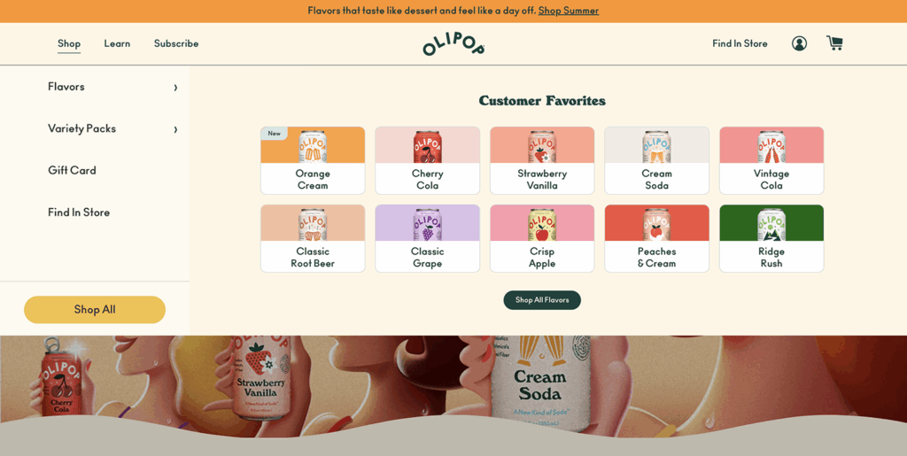
🛍️ Example: OLIPOP
OLIPOP, the fastest-growing functional beverage brand in the US, utilizes clean and intuitive ecommerce navigation to help customers find what they need in just a few clicks. With clearly defined categories— Shop, Learn, and Subscribe – OLIPOP makes browsing effortless while still showcasing bestsellers and essential info.
Remember: users browse emotionally. In industries like paving, people search by style and colour, not technical specs like “paving slab size”.
3. Vague CTA Text
Your CTA (Call-to-Action) should tell users exactly what to do. Text like “Learn More” doesn’t guide or inspire action.
✅ How to fix:
Write actionable CTA copy (e.g., action-oriented text like “Shop Women’s Boots”)
Avoid generic or unclear language.
Create a sense of urgency: use language that implies a sense of immediacy, like “Now,” “Get,” and “Today” in your CTAs.
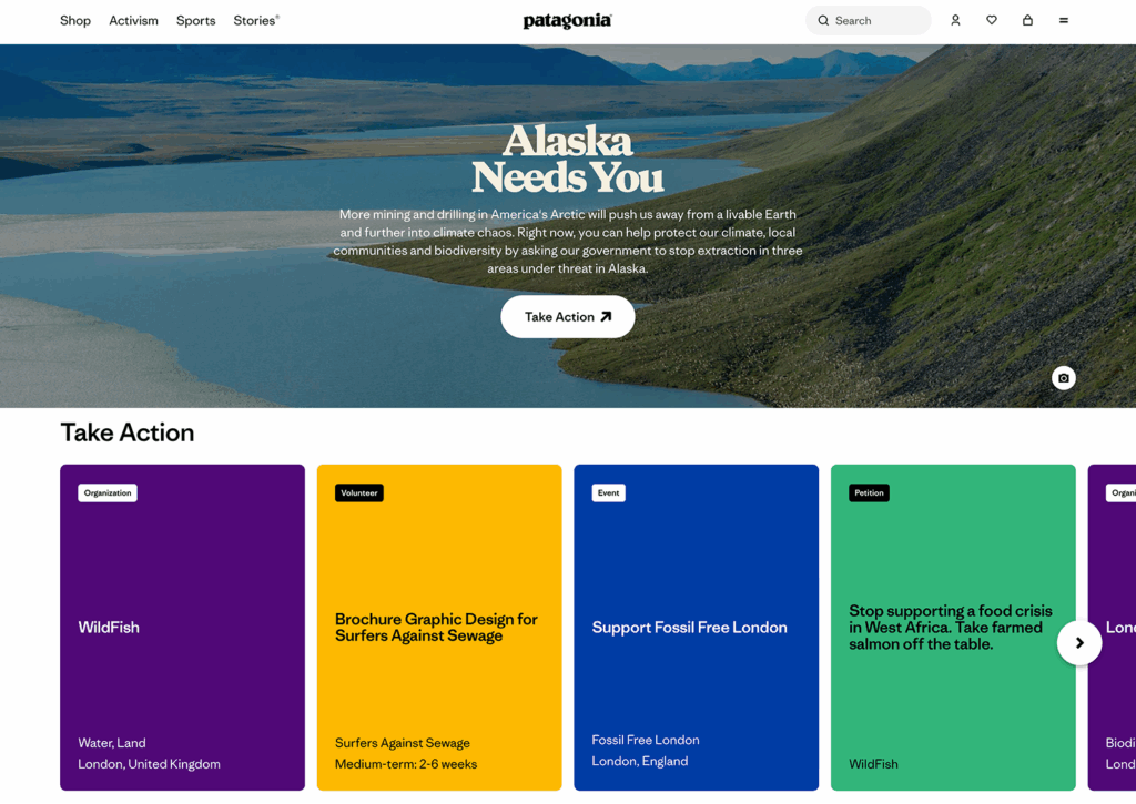
Patagonia simplifies navigation by focusing on what matters most to its customers: Shop, Activism, Sports, and Stories – eliminating the clutter of overwhelming menus. This smart structure helps guide users directly to their areas of interest.
On its Activism page, Patagonia features a bold call to action: “Take action.”
This CTA cleverly serves a dual purpose – encouraging users to engage with the site and inviting them to participate in real-world environmental efforts through grassroots volunteer opportunities. It’s a compelling example of how a CTA can align with brand values while driving meaningful engagement.
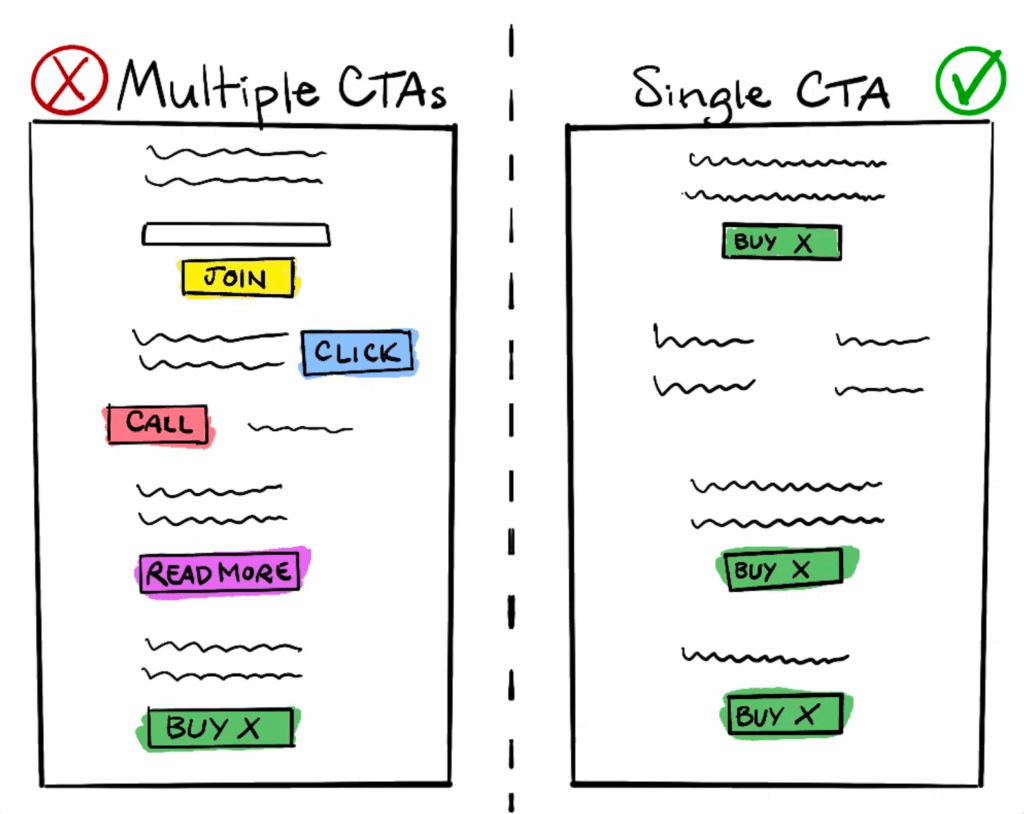
4. Too Many CTAs Competing
Don’t overwhelm users with multiple CTAs. One should clearly stand out.
✅ How to fix:
Identify the main CTA (probably “Add to Basket”).
Use one consistent brand colour for CTAs and limit its use elsewhere.
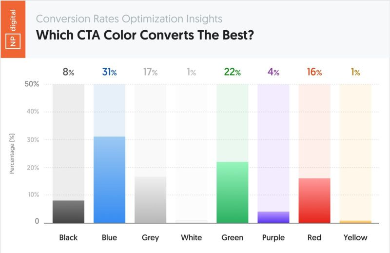
Note: Call-To-Action Button Color
Something as simple as changing the color of your ‘Add to Basket’ button can have a dramatic impact on conversions. There are cases, when switching from one color to another reduced cart abandonment by up to 50%.
While the best-performing color will vary by site, A/B testing is key. Generally, using a button color that contrasts with the rest of your design – often a secondary brand color – helps draw attention and encourages clicks.
5. Poor Tap Targets and Popups on Mobile
Stats:
With 74% of users more likely to return to a site that offers a smooth mobile experience, optimizing for mobile isn't just a nice-to-have – it's essential for driving conversions.
Mobile is where most browsing happens. Poor UX here causes frustration and leads to rage clicks and high bounce rates. (Source: Hotjar)
✅ How to fix:
Test your mobile experience regularly.
Avoid overlapping popups.
Ensure buttons and links are large enough and spaced appropriately.
💡 Mobile Popup UX: Quick Tips to Avoid Irrelevance
Prioritize Relevance. Don’t interrupt users with generic popups; target based on behavior, device, or page context.
Keep It Small. Use compact formats like sticky bars or slide-ins instead of full-screen popups.
Simplify the Message. Limit copy, images, and form fields to only what’s essential.
Always Include a Clear Exit. Make sure the close button is visible and easy to tap on mobile.
Pilgrim uses a floating button that triggers a signup form, offering a 10% discount once the visitor clicks it, ensuring minimal disruption to the user’s journey.
Limit Popup Frequency. Avoid bombarding users; don’t show multiple popups on one page.
Use Mobile-Specific Designs. Tailor popup layout and triggers to mobile behavior and screen size.
Test Before You Assume. A/B test popup types, colors, and triggers to learn what actually converts.
6. Unprofessional Design
Users judge credibility in milliseconds. If your site looks unprofessional, they won’t trust it.
✅ How to fix:
Use consistent branding.
Invest in professional design or theme customisation.
5 Proven Conversion Tricks You Can Try Today
Sometimes, it’s not about fixing what’s broken but about adding what works. Here are five tried and tested CRO tactics that boost conversions:
1. Urgency & Scarcity Use countdown timers or “Only 3 Left!” badges to create urgency and FOMO (fear of missing out).
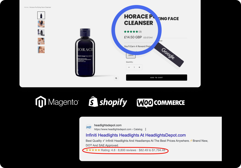
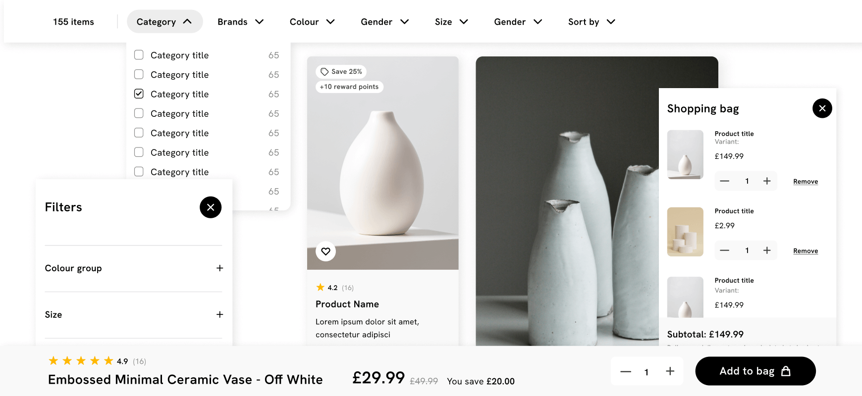
2. Social Proof Customer reviews, ratings, and UGC (user-generated content) build trust fast. Show what others are saying.
3. Anchoring Display the original (higher) price next to the sale price to make the deal feel more valuable.
4. Loss Aversion Offer free trials or hassle-free returns. People are more motivated to avoid loss than to gain something.
5. Cognitive Ease Simplify checkout with Apple Pay, PayPal, or one-click solutions. The less they think, the more likely users will complete the purchase.
The Real Secret to More Conversions? Stop Guessing.
There’s no magic formula for conversion – but there is a proven approach:
Understand what you’re selling and the user’s intent.
Gather data, create hypotheses, and A/B test your ideas.
Remove friction and guide users step by step.
Invest in good UX/UI to eliminate frustration and build trust.
Your Action Plan: 3 Things to Do Right Now
1. Start Collecting Data
Install behavioural analytics tools like Microsoft Clarity (it’s FREE!) or Hotjar. Use heatmaps and session recordings to watch how users interact with your site.
2. Audit Your Site
Identify friction points and categorise them into:
Fix immediately
Potential tests
Needs further investigation
Book a review session with our CRO or a UX experts to prioritise.
Conduct 30–40 minute interviews with customers who bought from you 1–3 months ago. Incentivise them with a voucher. Ask why they bought, what almost stopped them, and what could’ve made the experience better. These insights are gold.
In Summary
UX, UI & CRO aren’t optional – they’re essential for ecommerce growth. While competitors spend more on traffic, you can spend smarter by converting better.
From site speed to CTA clarity to simplified checkouts, every detail matters.
The goal? Less friction, more flow – and a website that sells.