TECHNOLOGIES

All technologies

Need assistance? Talk to the expert

MageCloud Customers

Discover how ecommerce businesses worldwide use MageCloud to power their success.

Stop Losing Customers: UX/UI Fixes for Your Product Pages

Discover essential UX/UI tips to optimise your ecommerce product pages for higher conversions, better user experience, and increased customer trust.

Picture of Ana
Ana

Content Manager, MageCloud

I already have my own ecommerce store!
Any expert advice to share?

I have some questions, and I’m looking for guidance
from an e-commerce expert.

TABLE OF CONTENTS

In ecommerce, the product page is where everything culminates.

Your homepage may attract, and your category pages might inform, but it’s your product page that seals the deal. It’s the last stop before a customer commits — or bounces.

With rising customer acquisition costs and decreasing attention spans, the need for a high-performing product page has never been more urgent. In this article, we’ll explore the modern expectations of today’s online shoppers, the principles of high-converting UX/UI design, the newest trends emerging in ecommerce, and examples from industry leaders who are setting the standard.

As part of our ongoing efforts to improve customer engagement and conversion rates, we’ve been working on refining website navigation and optimising user experience (UX) across multiple projects. 

Below, we highlight key updates and insights from our recent work, provided by our UX/UI expert, Adam Forshaw.

So, let’s examine the latest UX/UI trends for product pages that can turn your ecommerce site into a conversion machine.

Understanding Today’s Ecommerce Shoppers

The ecommerce customer of 2025 is savvy, impatient, and highly visual. 

They expect seamless experiences across devices, intuitive navigation, lightning-fast load times, and personalized content that speaks to them. If a product page doesn’t meet those expectations, they’ll bounce — often within seconds.

Today’s shoppers no longer just browse.

They scan.

  • 📊 Stat Alert!

    50% of potential sales are lost because users can’t find what they need (Forrester Research).

    → 38% of visitors leave if the website layout is ugly or confusing (HubSpot).

They want visual confirmation, trust indicators, and answers to their concerns without having to dig through cluttered layouts. From fit guides to reviews to real-time delivery estimates, every detail on the product page must serve a purpose—and serve it fast.

The Psychology Behind Great UX/UI

Great UX/UI on product pages isn’t about adding more design elements. It’s about creating a layout and flow that aligns with people’s thoughts and decisions online.

💡  Clarity must come before creativity. 

The best product pages are built around answering four questions: 

1. What is this? 

2. How does it help me? 

3. Can I trust it?

4. And what do I do next?

💡  Emotion plays a powerful role too. 

Rather than presenting a product coldly with a price and feature list, successful brands use visuals, copy, and layout to evoke desire. 

A carefully chosen hero image showing the product in use can be more powerful than a dozen bullet points.

💡 Visual hierarchy is also critical. 

The eyes should be drawn to what matters most: first the product, then the call to action, then supporting information like price, reviews, and product details. Typography, white space, and element size all help guide the user journey.

Let’s take our clients websites as examples. For them, we focus on optimising the UX to drive higher engagement and conversions. 

What Modern Product Pages Get Right

Product pages that convert in 2025 are lean, fast, and thoughtfully structured. Micro-interactions—those tiny animations and visual cues when you hover over a button or select a variant—add depth and responsiveness, giving users feedback that makes the experience feel alive.

A trend that’s become standard is the sticky “Add to Cart” button, especially on mobile. When users scroll through images or reviews, they should never lose sight of how to purchase. This small change alone has been shown to reduce bounce rates and increase mobile conversions significantly.

Personalisation has also gone from nice-to-have to expected. Smart product pages dynamically adjust sizing suggestions based on past purchases, offer localized delivery estimates, and even recommend complementary products in real time. Amazon has led the way here, but many DTC brands have started integrating tools that mimic this level of tailored interaction.

One of the most powerful UX features is real-time inventory feedback. When users see that only three items are left in stock or that they need to order within an hour for same-day shipping, the fear of missing out kicks in. This urgency, if used authentically, can nudge shoppers toward checkout without feeling manipulative.

Visual presentation continues to evolve. Basic product images are no longer enough. 

💡 In 2025, users expect:

  • → 360-degree views, 

    → lifestyle photography, 

    → zoom-in capabilities,

    → videos showing the product in action.

Some brands are taking it even further with augmented reality previews, especially in beauty and home décor.

In the apparel space, solving the size and fit challenge has become a priority. Tools powered by AI now suggest sizing based on previous purchases, return data, and user-submitted fit feedback. Reviews that are tagged with customer body types and sizing insights provide invaluable context and reduce return rates.

Content That Converts

Copy still plays a crucial role. But instead of long paragraphs, content is now designed for quick consumption. Product benefits should appear before technical specs. Descriptions are broken down into digestible chunks, often using expandable sections or visual icons. FAQs are increasingly built into the product page itself, using data from actual customer queries.

Social proof is deeply embedded in modern UX, not just shoved into a review section. Top-performing pages display user-generated content, verified buyer badges, customer-submitted photos, and real-time pop-ups showing recent purchases.

This is about more than persuasion — it’s about building trust.

Client Case Studies: Small Changes, Big Impact

Across our work with ecommerce brands, we’ve seen firsthand how small UX/UI changes can lead to major shifts in performance.

For one direct-to-consumer fashion brand, we reorganized the product layout to prioritize visuals, added a sticky CTA on mobile, and introduced a fit-finder tool that suggested sizing based on purchase history. In less than a month, conversions rose by 24%, and bounce rates dropped by 38%.

In another case, we worked with a home décor company struggling to showcase product variants. By integrating interactive color swatches and dynamically updating the preview image based on user selections, we increased engagement time by 40% and saw a 15% lift in add-to-cart activity.

The common thread? 

These weren’t full redesigns. They were targeted improvements based on real user behavior and design best practices.

📎 Case Studies: Electric Bikes

Before
After

To enhance clarity and usability, we implemented strategic design updates to the product page, ensuring seamless navigation and a more intuitive browsing experience. These improvements aim to reduce drop-offs, improve product discoverability, and ultimately boost conversions.

  • Highlight Availability Clearly

    Use attention-grabbing indicators like “In stock” or “Available” to set expectations and create urgency.

  • Display Savings and Affordability

    Clearly show discounts and finance options (e.g., “Pay from $67.99/week”) to make price points feel more accessible.

  • Use Smart Visual Hierarchy
    • – Make navigation cues and image carousels more visible and intuitive.

    • – Use gradient overlays to tease additional content without overwhelming users.

  • Anchor to Key Details

    Edd jump links like “See Full Specification” so users can navigate quickly.

  • Give Options Context

    Use tooltips, popups, or “?” icons to explain sizing, colors, and upgrades.

  • Encourage Engagement

    Add features like a wishlist, ask questions, and reminders for restocking to create interaction points

  • Break Down Complex Info

    Use icons, short blurbs, and review summaries to present tech specs and benefits in an easily digestible format.

  • Make Reviews More Prominent

    Place star ratings and review summaries above the fold to boost trust quickly.

  • Make Comparison Easier

    Include features to compare similar products or show alternative suggestions based on brand, price, or specs.

  •  Guide Store Interactions

    Include handholding content like “How would you guide someone in the store?” to blend digital with physical experiences.

  •  Improve Mobile Experience

    Use accordions and collapsible sections to reduce scroll and organize content better on mobile.

  •  Surface Important Add-ons

    Upsell with extras & upgrades in a collapsed section that opens on demand—keep the base offer simple.

  •  Enhance Trust with Delivery Options

    Clearly show delivery methods with icons and explanations, improving transparency and confidence.

  •  Style Elements Consistently

    Use a cohesive style guide: new icons, font sizes, consistent button treatments, etc.

  •  Don’t Forget Accessibility

    Merge headers, use legible font sizes, and ensure call-to-action buttons are distinguishable and actionable.

Pitfalls to Avoid

As important as it is to know what works, it’s equally important to know what doesn’t. Common issues we still see far too often include cluttered pages with too much text, unclear calls-to-action, hidden return or shipping info, and mobile experiences that feel like afterthoughts.

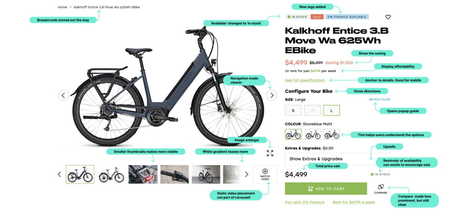
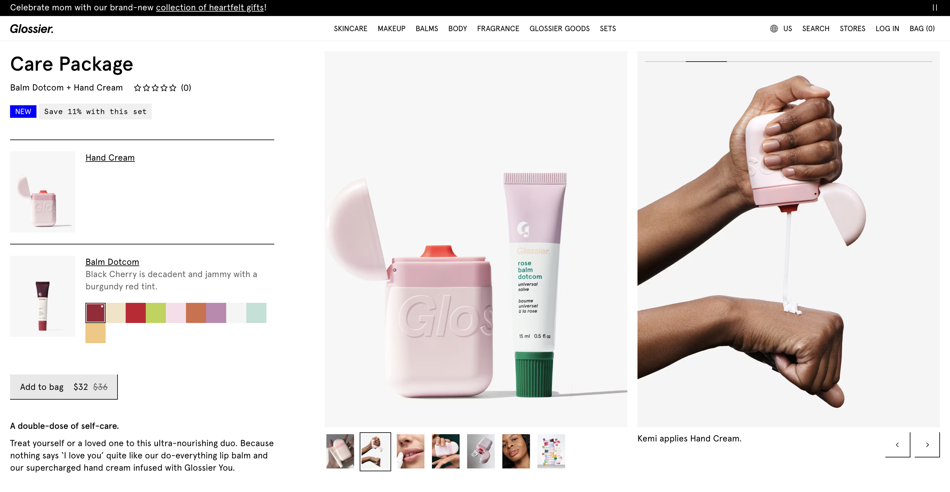
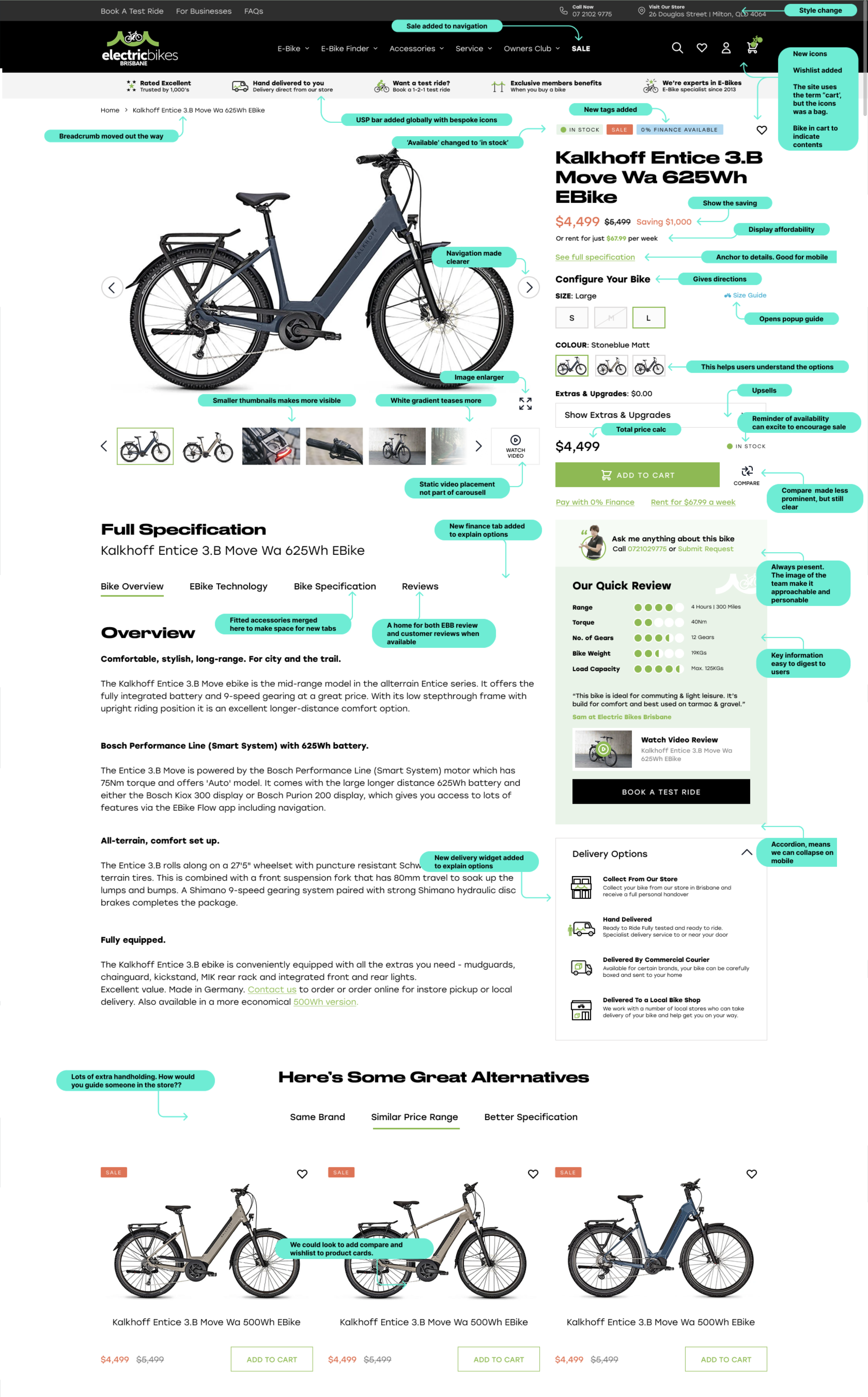
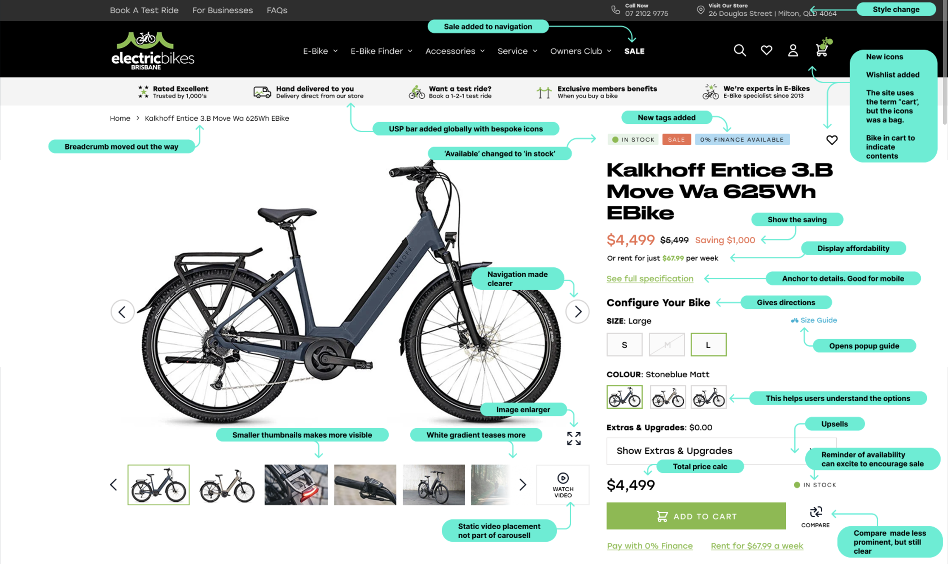
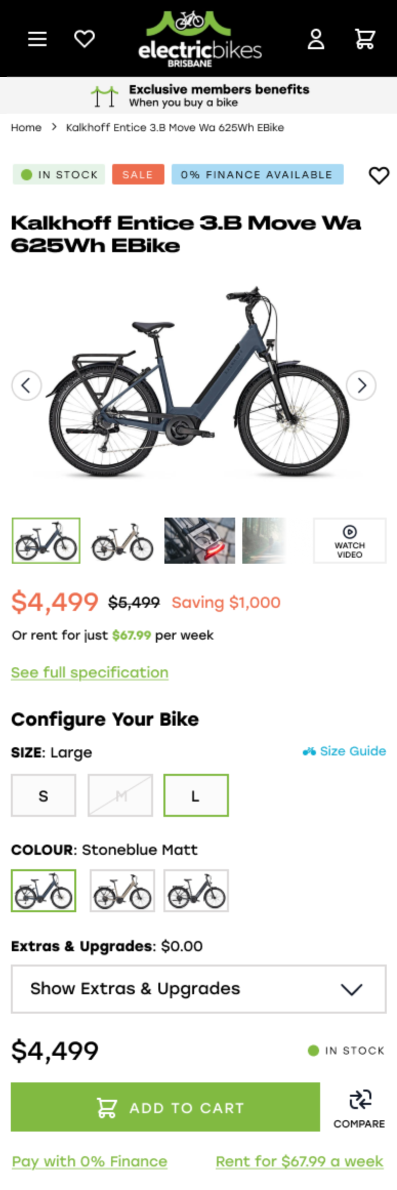
  • 🚫 Cluttered Product Layouts

    Too many buttons, too much text, and everything screaming for attention? That’s not persuasive—it’s panic-inducing. Declutter, prioritize, and let your product breathe.

  • 🚫 Neglecting Accessibility

    Your product page should be easy to navigate with a keyboard, readable by screen readers, and high-contrast enough for all users.

  • 🚫 Missing or Hidden Key Info

    If users have to dig to find shipping details, return policies, or size guides, you’ve already lost them. Transparency builds trust—burying details destroys it.

  • 🚫 Generic Product Descriptions

    “This shirt is nice.” Cool, but why should I care? Product copy should speak benefits, not bore with clichés. Tell a story. Make it resonate.
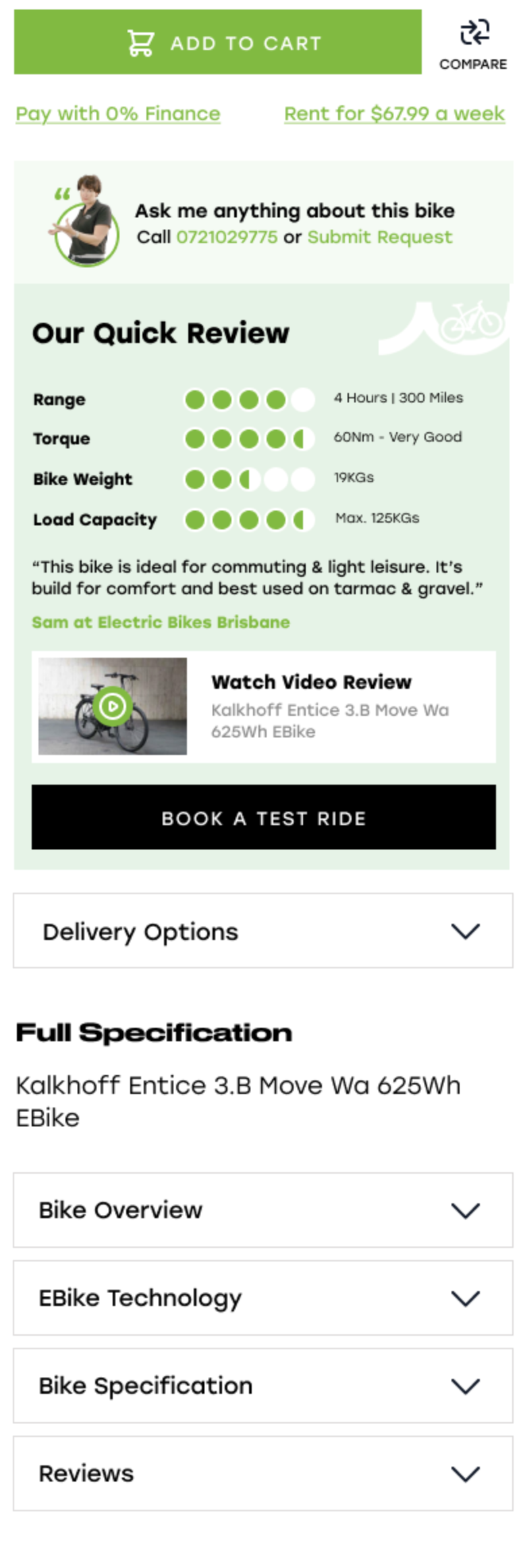
  • 🚫 Invisible CTAs

    If your “Add to Cart” button blends into the background or disappears as users scroll, it’s game over. CTAs should be obvious, persistent, and action-oriented.

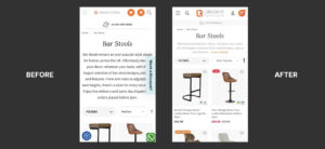
  • 🚫 No Mobile Optimization

    If your product page only works on a 27-inch monitor, congratulations — you’re ignoring 70% of your users. Mobile-first is no longer a trend; it’s a standard.

  • 🚫 Slow Image Load or Broken Galleries

    If product images don’t load quickly, or worse—don’t load at all—expect instant exits. Optimize visuals without compromising quality. A pixelated product is a lost sale.

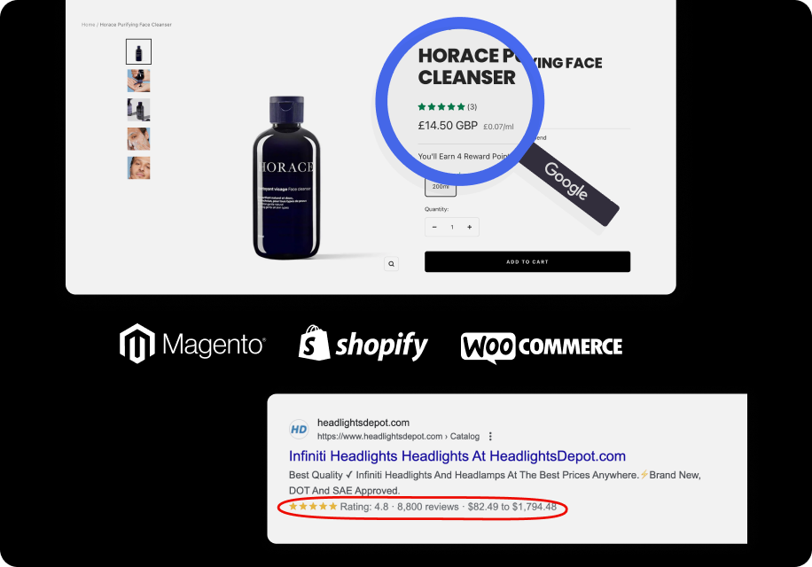
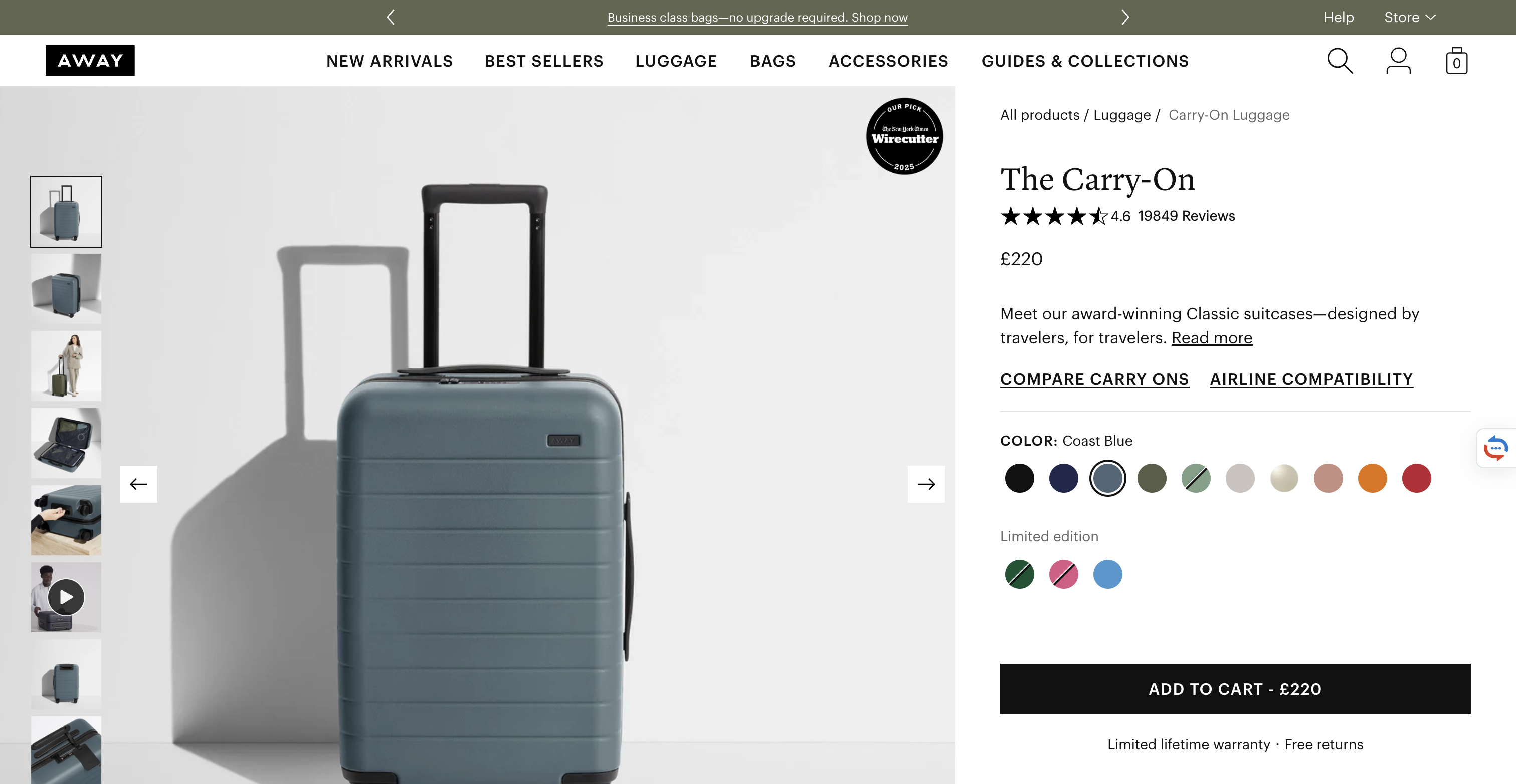
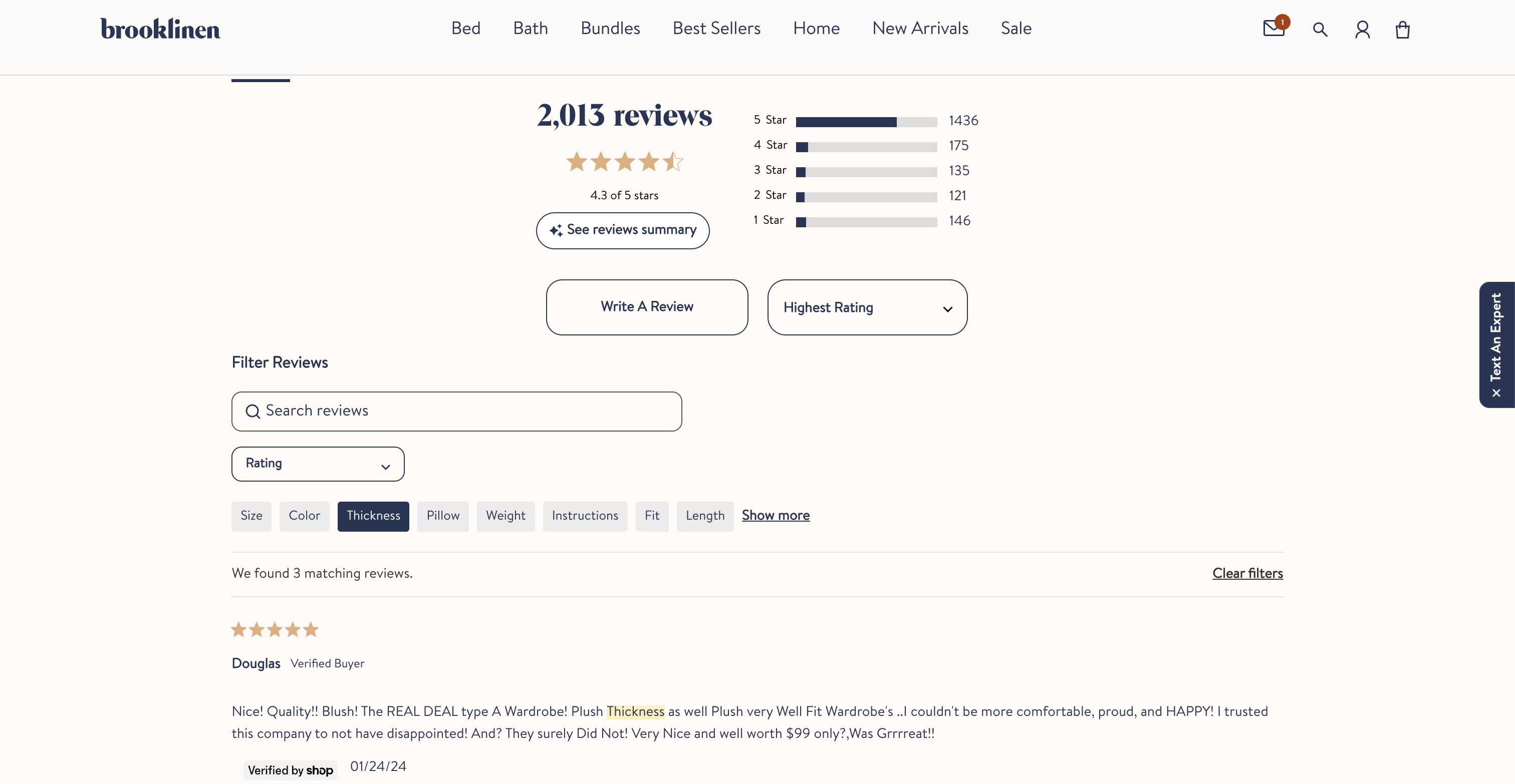
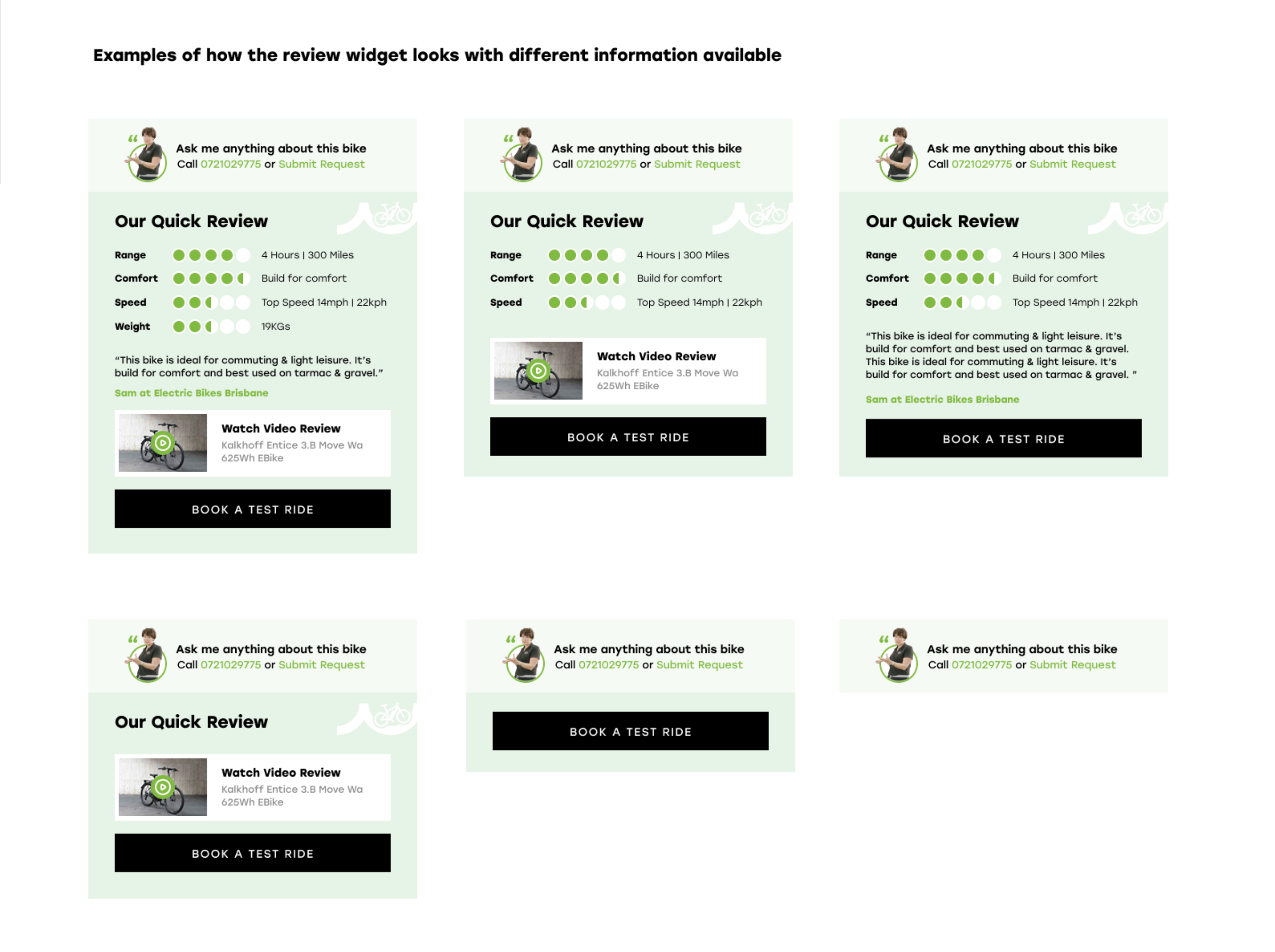
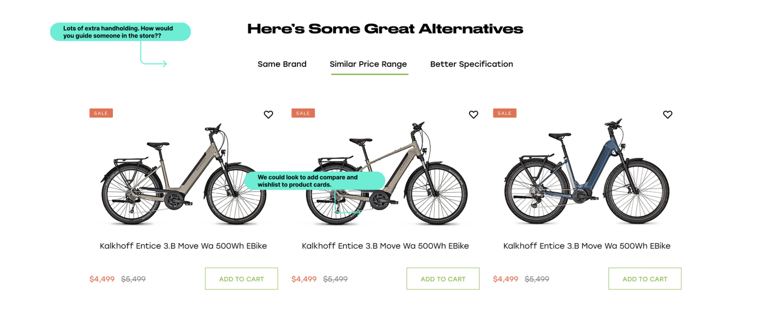
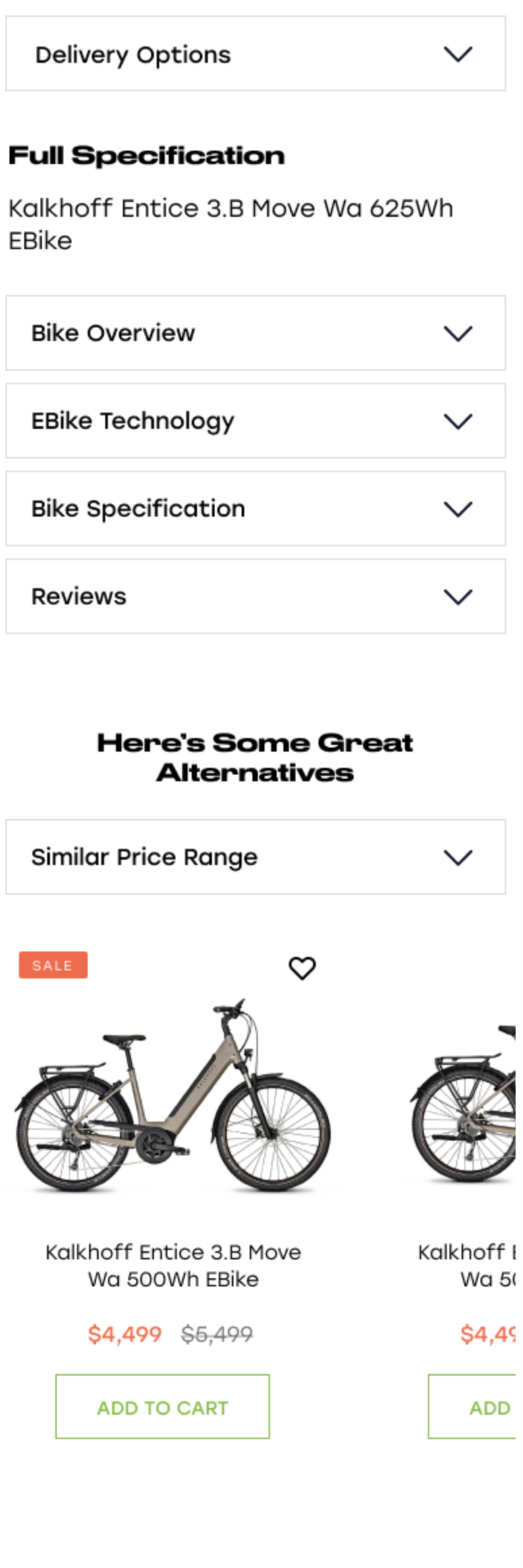
  • 🚫 Lack of Social Proof

    No reviews? No real customer photos? Feels sketchy. Shoppers trust other shoppers — give them evidence that real people actually love your product.

  • 🚫 Outdated or Inaccurate Inventory Info

    “Available” until checkout says “Oops, sold out”? That kind of UX betrayal kills trust. Always show real-time availability and shipping expectations.

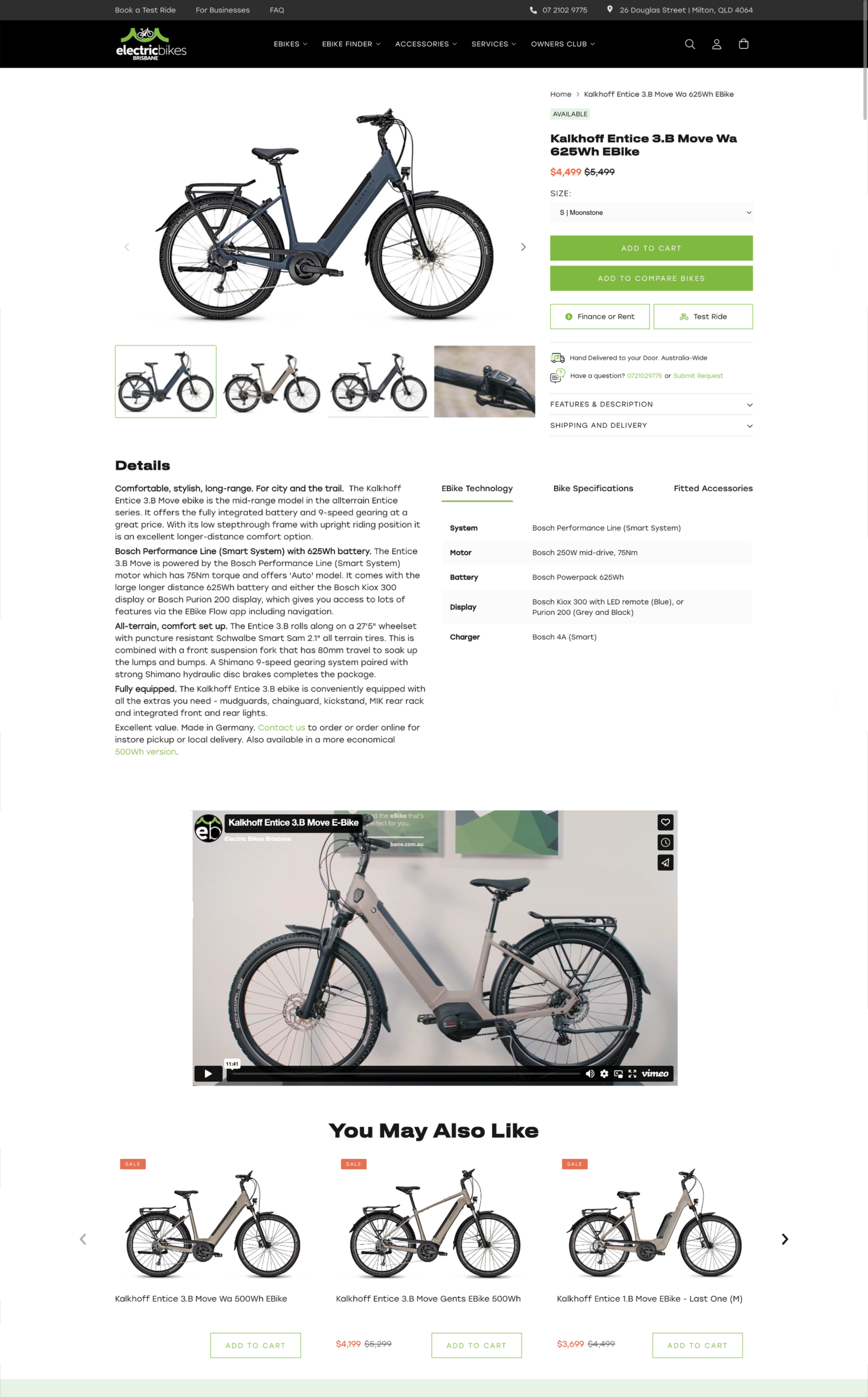
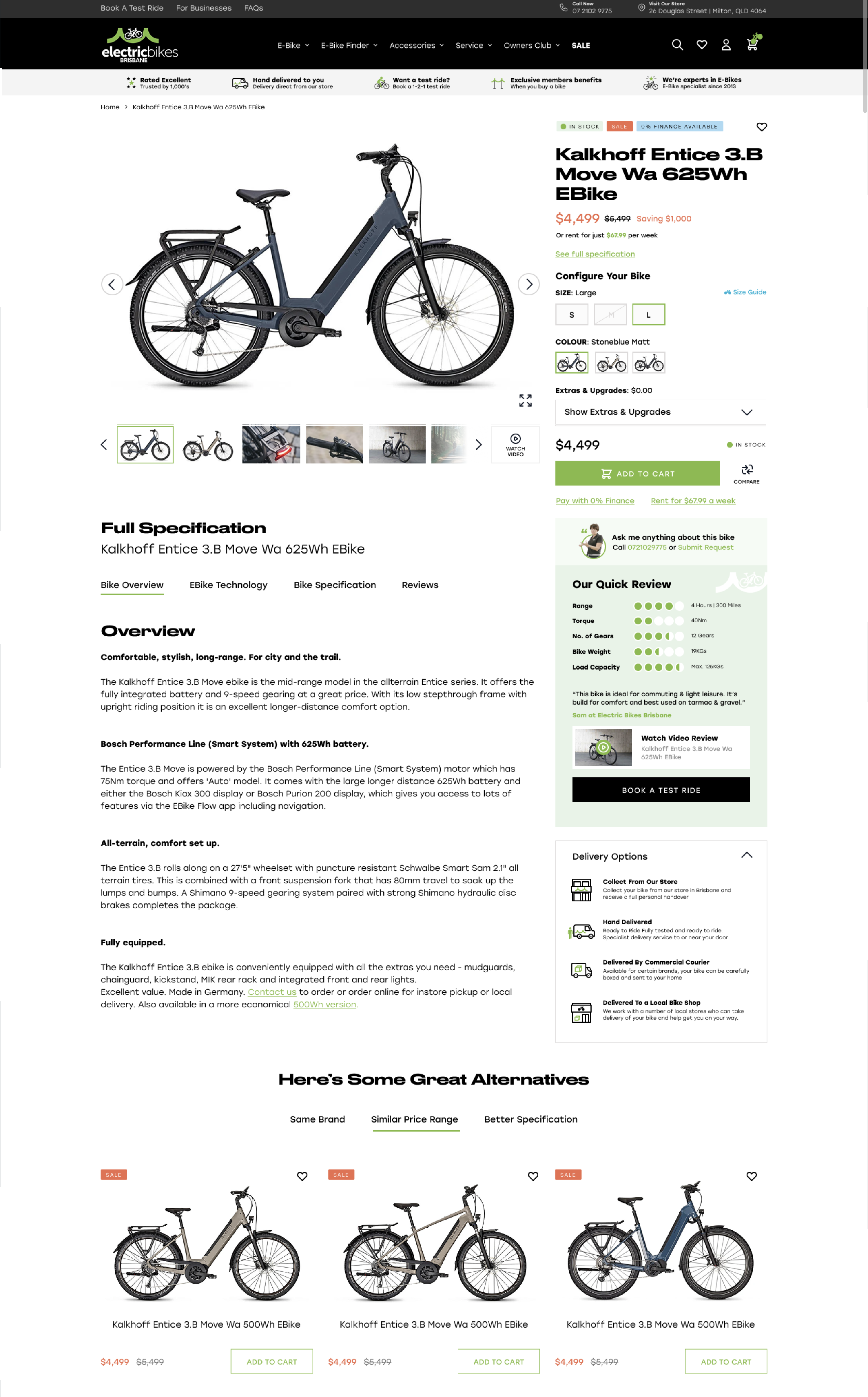
  • 🚫 Overloaded Variant Selectors

    Dropdowns inside dropdowns inside dropdowns? Don’t make users work just to pick a color. Keep variant selection simple, visual, and responsive.

  • 🚫 Pop-Ups That Attack on Entry

    Instant pop-up, auto-play video, newsletter modal… before users even see your product? Chill. Let visitors explore before you ask for anything.

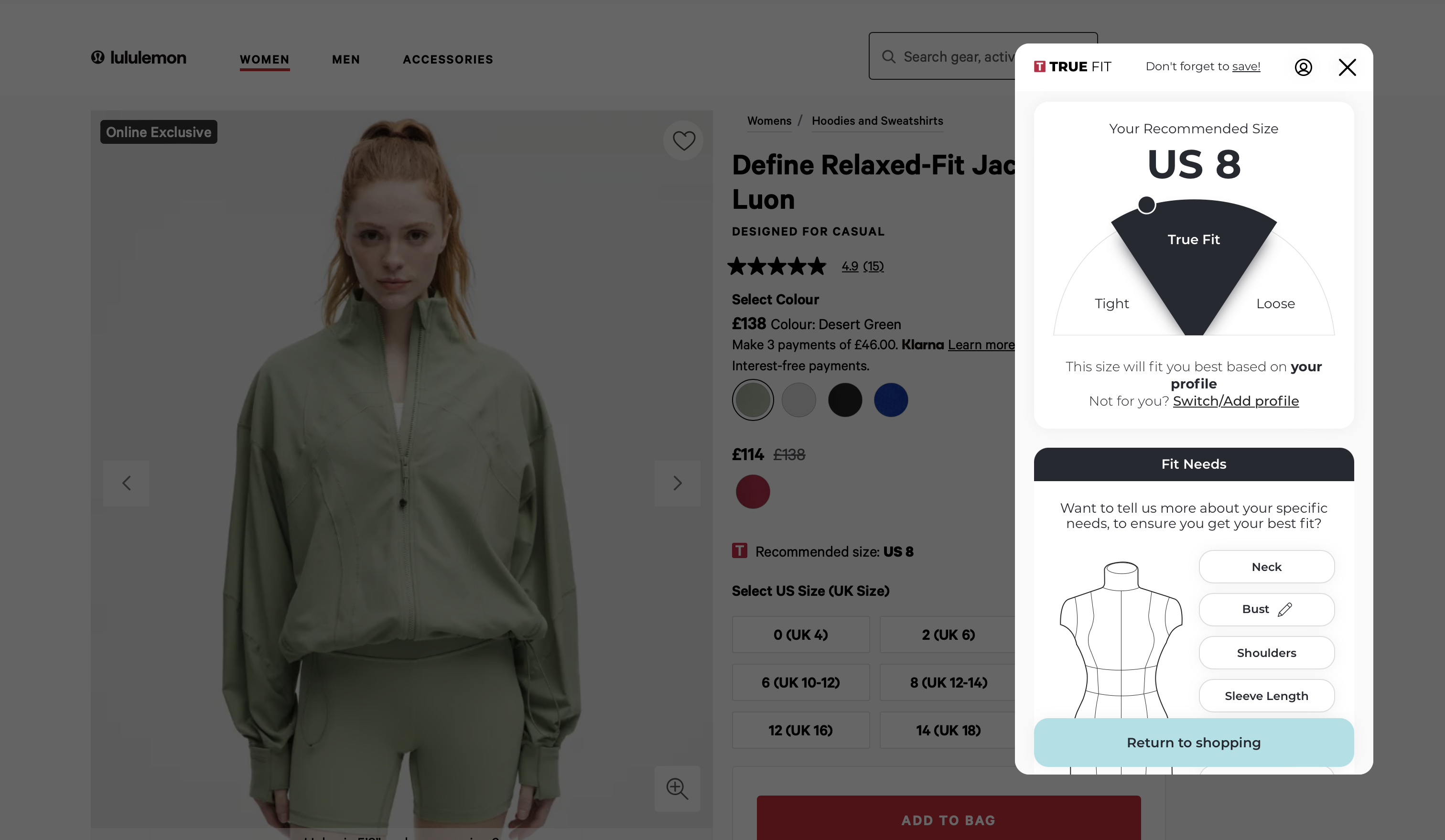
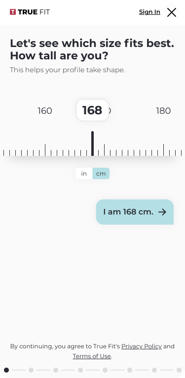
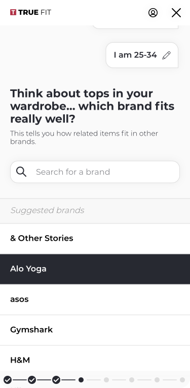
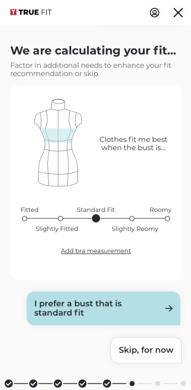
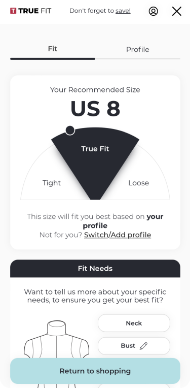
  • 🚫 No Sizing or Fit Help

    Selling apparel without sizing guidance is ecommerce malpractice. Offer fit tools, customer sizing feedback, or model specs—or expect high return rates.

  • 🚫 Forgetting to A/B Test

    Your product page isn’t finished—it’s evolving. If you’re not testing layouts, copy, images, or CTAs, you’re leaving conversions on the table.

And finally, some brands launch their product page and forget it. But UX/UI is not a “set it and forget it” game. Testing, measuring, and iterating should be ongoing practices.

Final Thoughts: The Product Page as a Living Asset

In 2025, your product page is not just a digital shelf — it’s a living, evolving sales tool. It should be continuously optimized, adjusted for trends, and shaped by the feedback of real users.

Every scroll, click, and bounce tells a story. The best ecommerce brands are those that listen.

If your product page isn’t converting like it should, it might not be a product problem — it might be a design problem

Fortunately, that’s something you can fix.

So, what’s the first thing you’ll fix?

Let’s talk! 

Ready to discuss your project?

Book a meeting with our expert Paul

Have we piqued your interest?

Let us prove our skills and provide you with a free video review of your eCommerce site. Schedule a meeting with our team.
Cities we operate in
ECOMMERCE & MARKETING DAY
Ecommerce Camp Birmingham 2025
Join the UK Ecommerce & Marketing Community! Connect with industry peers, gain insights from experts, and elevate your digital strategy.
📅 Fri, 9 May 2025, 9:00 - 17:00 BST
Ecommerce Camp Birmingham 2025
📅 Fri, 9 May 2025, 9:00 - 17:00 BST