TECHNOLOGIES

All technologies

Need assistance? Talk to the expert

MageCloud Customers

Discover how ecommerce businesses worldwide use MageCloud to power their success.

UX/UI Navigation Updates in Ecommerce: The Secret Sauce for More Sales

Ecommerce navigation isn’t just about looking pretty – it’s about helping customers find what they need quickly, easily, and (ideally) without rage-quitting.

Picture of Paul Ryazanov
Paul Ryazanov

CEO, MageCloud | eCommerce Consultant & Speaker

I already have my own ecommerce store!
Any expert advice to share?

I have some questions, and I’m looking for guidance
from an e-commerce expert.

TABLE OF CONTENTS

Have you ever landed on a website and felt lost, like you were wandering through a digital maze with no exit sign?

You’re not alone.

Bad navigation is one of the top reasons customers abandon websites faster than a free sample table at a grocery store.

Ecommerce navigation isn’t just about looking pretty – it’s about helping customers find what they need quickly, easily, and (ideally) without rage-quitting. A well-optimised navigation system can mean the difference between a sale and a frustrated user throwing their phone across the room.

As part of our ongoing efforts to improve customer engagement and conversion rates, we’ve been working on refining website navigation and optimising user experience (UX) across multiple projects. 

Below, we highlight key updates and insights from our recent work, provided by our UX/UI expert, Adam Forshaw.

So, let’s dive into the latest UX/UI navigation trends that can turn your ecommerce site into a conversion machine.

Why Should You Care About Navigation?

1. Because Confused Shoppers Don’t Buy

Ever heard the phrase “A confused mind always says no”? Well, that applies perfectly to e-commerce. If customers can’t find what they’re looking for within a few seconds, they’ll bounce faster than a checkout page without Apple Pay.

  • 📊 Stat Alert!

    50% of potential sales are lost because users can’t find what they need (Forrester Research).

    → 38% of visitors leave if the website layout is ugly or confusing (HubSpot).

  • 💡 Fix It:

    Keep your menu structure simple, use familiar labels (no one knows what “Explore Our Universe” means), and don’t bury your bestsellers in a navigation black hole.

2. Because Good Navigation Boosts Conversions

What if I told you that fixing your navigation could increase your sales by 30%? 

No, this isn’t an infomercial – it’s a fact.

Let’s take our clients websites as examples. For them, we focus on optimising the UX to drive higher engagement and conversions. 

📎 Case Studies: Penshop + Rok Hardware

To enhance clarity and usability, we implemented strategic design updates to the header and menu, ensuring seamless navigation and a more intuitive browsing experience. These improvements aim to reduce drop-offs, improve product discoverability, and ultimately boost conversions.

A well-optimised header is crucial for conversions, as it’s the first thing users interact with. Here are the best and latest UI/UX tips for a high-performing ecommerce header:

If you sell thousands of products, a simple menu won’t cut it. Mega menus (like Walmart’s) organize large inventories into clear, clickable sections. Bonus points if you add images!

  • Keep It Clean & Minimalistic

    Avoid clutter – prioritise essential elements like the logo, search bar, navigation menu, and cart. A clean design improves usability and directs focus to conversions.

    💡 Pro Tip: Mega Menus for Massive Catalogs

    → If you sell thousands of products, a simple menu won’t cut it. Mega menus (like Walmart’s) organize large inventories into clear, clickable sections. Bonus points if you add images!

  • Implement a Sticky Header (so users don’t have to scroll back up)

    Who likes scrolling back up just to switch categories? No one. A fixed (sticky) header ensures easy access to the menu, search, and cart, enhancing navigation and reducing friction in the shopping experience.

  • Use a Prominent and Functional Search Feature

    A well-designed search function is essential for users seeking specific products. Ensure the search bar is easily accessible, preferably at the top of the screen, and includes features like autocomplete with search scopes and alternate query suggestions.

    📊 Stat Alert!

    → 79% of sites fail to include search scope in autocomplete suggestions, and 73% don’t suggest alternate queries, which can hinder the search experience.

    💡 Pro Tip: Voice & Visual Search

    → Too lazy to type? You’re not alone. 50% of shopping will be voice-powered by 2025. IKEA is already ahead with visual search – just snap a pic of a chair you like, and their site finds similar ones.

  • Highlight CTAs (Calls-to-Action) Clearly

    Ensure the “Cart,” “Sign In,” and “Checkout” buttons stand out with a contrasting color, clear text, and an intuitive position in the header.

  • Display Trust Signals (e.g., Free Shipping, Discounts)

    Adding subtle but visible trust indicators like “Free Shipping Over $50” or “30-Day Returns” can encourage more purchases.

  • Integrate Social Proof & Urgency

    Small elements like “🔥 Trending Now” or “⭐ 1,000+ Reviews” next to categories/products in the header can increase conversions.

  • AI-Powered Personalised Navigation & Dynamic Elements

    Use AI to display user-specific recommendations, last-viewed products, or special offers based on browsing behaviour. Imagine walking into a store where the shelves rearrange themselves based on your past purchases. That’s what AI-driven navigation does.

    💡 Example:

    eBay personalises homepage menus based on browsing history, boosting click-through rates by 35%.

  • Ensure Fast Loading & Smooth Animations

    A laggy header can hurt UX. Optimise images, minimise scripts, and use smooth micro-interactions to enhance user engagement.

  • Use Breadcrumbs (Not the Hansel & Gretel Kind)

    Ever gotten lost in a deep product page rabbit hole? Breadcrumb navigation helps users backtrack easily, reducing exit rates by 18%.

  • Prioritise Mobile Optimisation

    Use a mobile-first approach with a collapsible menu (hamburger icon) and easily tappable elements to ensure seamless browsing on smaller screens.

3. Because Mobile Users Are Taking Over the World

Did you know that 73% of all e-commerce sales now happen on mobile? If your navigation isn’t thumb-friendly, you’re losing customers – period.

📊 Stat Alert!

  • 57% of users won’t recommend a business with a poorly designed mobile site (Google).
  • A 1-second delay in load time = a 7% drop in conversions (Akamai).

💡 Fix It:

  • Put important buttons at the bottom (where thumbs naturally rest).
  • Use a mobile-friendly menu (like ASOS, which increased mobile conversions by 20% after redesigning theirs).
  • Speed matters! If your site loads slower than a dial-up connection in 1999, fix it.

📎 Case Study: Lakeland Furniture

Our primary goal is to streamline user journeys by identifying friction points that could lead to frustration and cart abandonment. 

We have implemented strategic changes for Lakeland Furniture mobile site navigation by analysing website behavior and user interactions to improve navigation and enhance clarity.

Before
After

Why a Good Mobile Menu Matters

  • Improves Navigation & UX

    A well-structured mobile menu helps users find what they need quickly. If navigation is unclear, visitors may leave for a competitor’s site.

  • Increases Conversions

    A cluttered menu creates friction in the shopping journey. Simplified menus with clear CTAs and quick access to key categories boost sales.

  • Enhances SEO

    Google prioritizes mobile-friendly sites. A responsive, easy-to-navigate menu reduces bounce rates and improves search rankings.

BEFORE

Best Practices for an Effective Mobile Menu

  • Keep It Simple and Organised

    Avoid overwhelming users with too many options. Stick to essential categories and use collapsible submenus to maintain a clean interface. Prioritize frequently visited pages, such as product categories, search, and the shopping cart.

  • Optimise for Thumb-Friendly Design

    Most users navigate mobile sites using their thumbs. Placing key menu options within easy reach – such as towards the bottom or along the sides – enhances usability and minimises frustration.

BEFORE & AFTER

  • Provide a Seamless Back Navigation

    Many users rely on the browser’s back button. Ensure that navigating back does not reset their search filters, cart contents, or browsing history. Persistent session data can help maintain a smooth experience.

  • Implement Clear CTAs and Quick Access Links

    Include direct links to key pages such as “Shop Now,” “Offers,” or “Cart.” Additionally, a persistent search bar within the menu can help users find products quickly, reducing time spent searching.

  • Leverage Gesture-Based Navigation

    Incorporate intuitive gestures like swiping to go back, pull-to-refresh, or horizontal scrolling for product image galleries. This makes navigation feel more natural and fluid.

  • Ensure Fast Loading and Responsiveness

    A laggy menu can drive users away. Optimise menu load times by reducing heavy scripts and ensuring smooth transitions. The responsive design guarantees that the menu functions well across different screen sizes and resolutions.

  • 💡 Pro Tip: Test & Optimise with A/B Testing


    Regularly test different header layouts, CTA placements, and color schemes to find what works best for your audience.

  • 💡 Pro Tip: Test with Real Users

    Regular usability testing on actual mobile devices will help identify navigation pain points. Gather feedback and make continuous improvements based on user behavior and analytics.

Avoid These UX/UI Nightmares

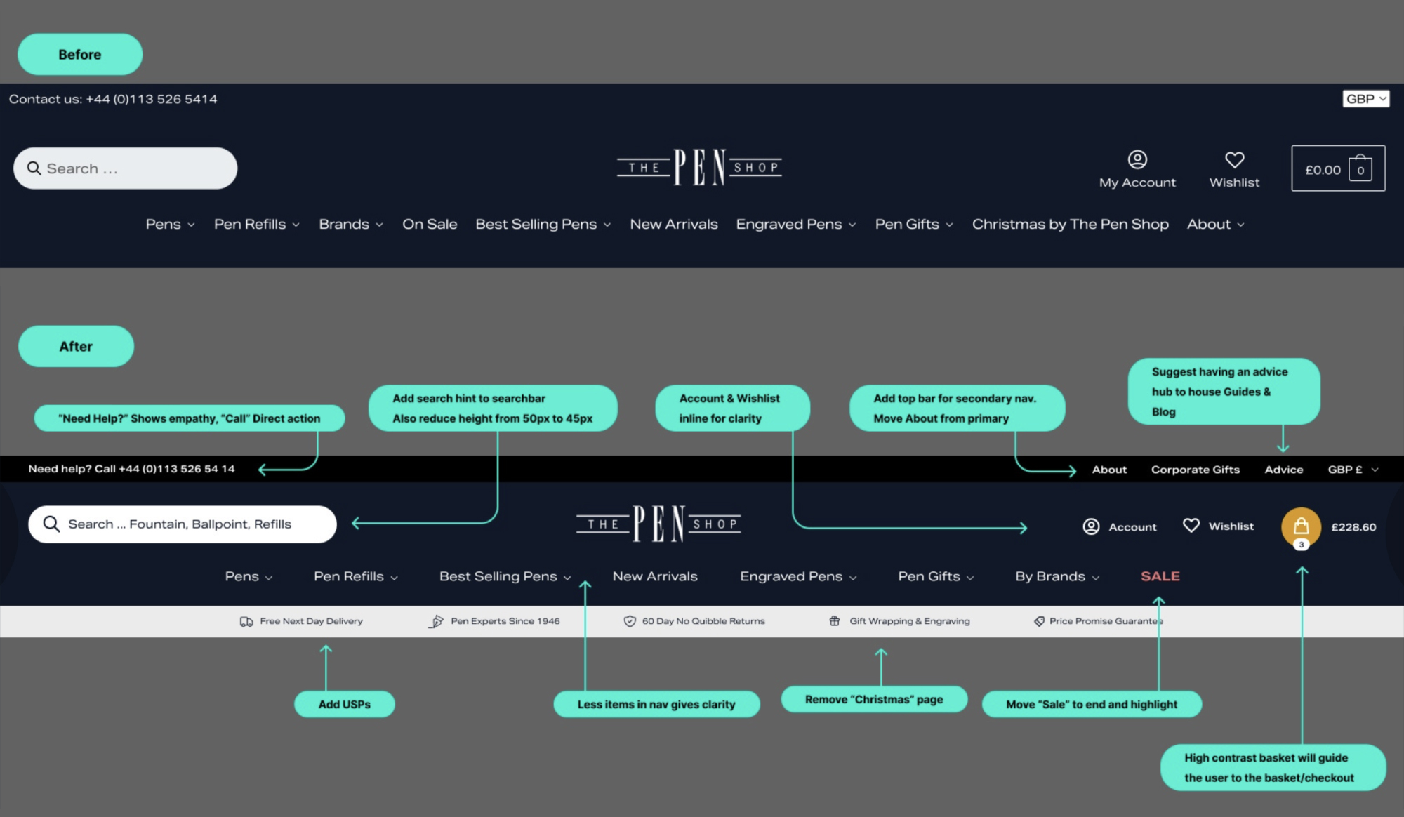
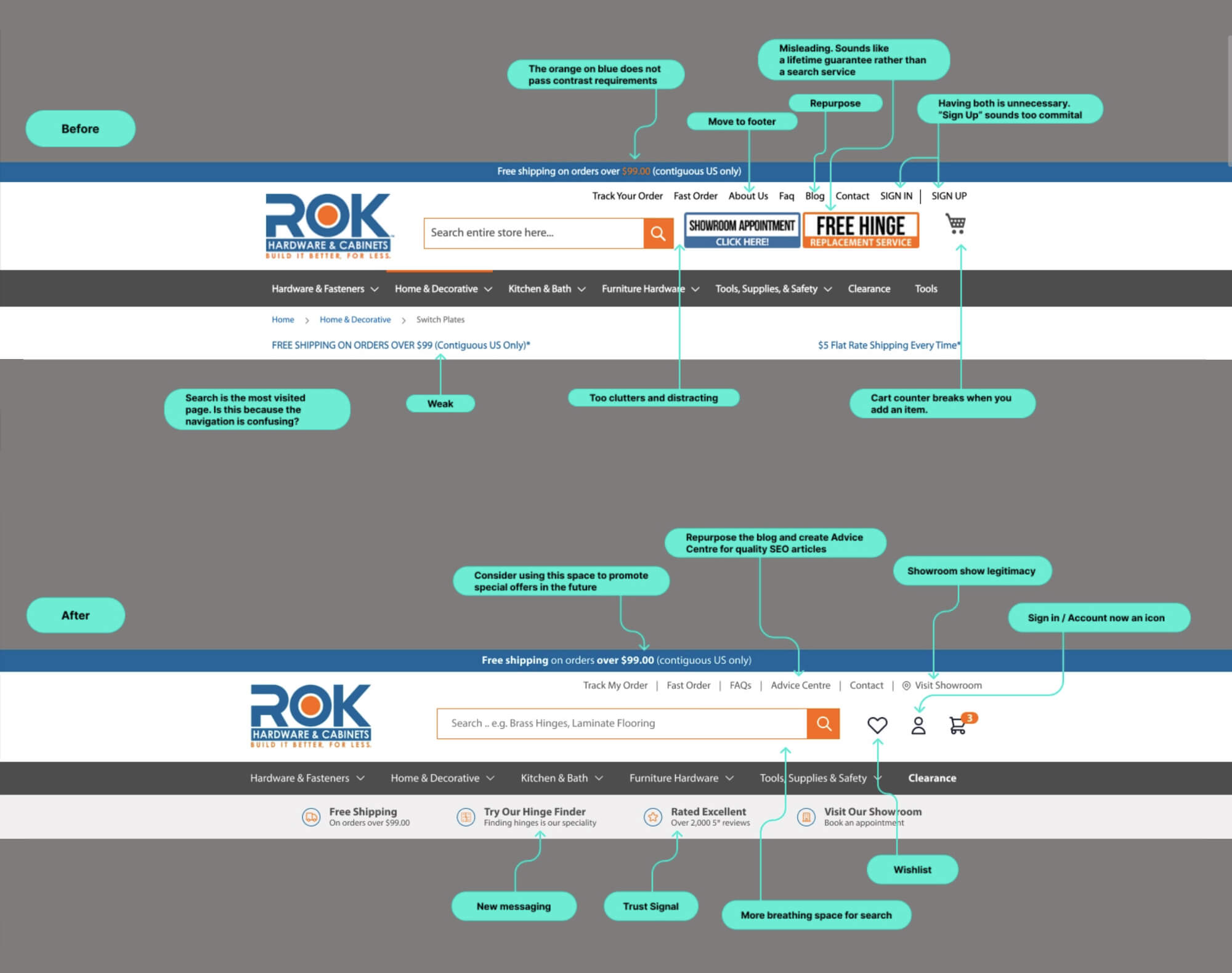
  • 🚫 Overcomplicated Menus

    Nobody wants to decode a sitemap just to buy socks. Keep it simple, or risk losing users to frustration.

  • 🚫 Mystery Meat Navigation

    If a button doesn’t clearly say where it leads, you’re playing a dangerous game. Users don’t have time for scavenger hunts.

  • 🚫 Forgetting the Search Bar

    If Amazon has one and you don’t, you’re doing something wrong. A hidden or missing search function kills conversions.

  • 🚫 Ignoring Mobile Users

    3 out of 4 shoppers are on their phones. If your site still acts like it’s 2012, fix it. Mobile-first isn’t optional – it’s survival.

  • 🚫 Intrusive Pop-Ups

    No one wants to be attacked by a newsletter signup before they even see your homepage. Be strategic, not annoying.

  • 🚫 Slow Load Times

    If users can microwave a snack before your page loads, they’re gone. Optimise images, scripts, and servers to keep things fast.

  • 🚫 Poor Contrast & Tiny Fonts

    If users have to squint or adjust brightness just to read, they won’t stick around. Prioritize readability over aesthetics.

  • 🚫 No Clear Call to Action (CTA)

    If your buttons say “Click Here” instead of something meaningful, expect high bounce rates. Guide users with strong, direct CTAs.

  • 🚫 Poor Contrast & Tiny Fonts

    If users have to squint or adjust brightness just to read, they won’t stick around. Prioritize readability over aesthetics.

  • 🚫 Autoplay Anything

    Videos or music blasting out of nowhere? Instant tab close. Let users control their experience.

  • 🚫 Broken or Dead-End Links

    A 404 page isn’t a fun surprise. Keep links fresh and always offer an easy way back.

  • 🚫 Ignoring Accessibility

    If your site isn’t usable by everyone, you’re turning away potential customers. Alt text, keyboard navigation, and screen reader support matter.

  • 🚫 Complex Checkout Process

    Every extra field or unnecessary step loses customers. Streamline checkout like your business depends on it – because it does.

Final Thoughts: Small Changes = Big Money

UX/UI navigation updates aren’t just about looking good – they directly impact sales, customer loyalty, and retention. If you make your site easy (and enjoyable) to navigate, people will stay longer, browse more, and buy more.

So, what’s the first thing you’ll fix? 


Let’s talk! 

Ready to discuss your project?

Book a meeting with our expert Paul

Have we piqued your interest?

Let us prove our skills and provide you with a free video review of your eCommerce site. Schedule a meeting with our team.
Cities we operate in
ECOMMERCE & MARKETING DAY
Ecommerce Camp Birmingham 2025
Join the UK Ecommerce & Marketing Community! Connect with industry peers, gain insights from experts, and elevate your digital strategy.
📅 Fri, 9 May 2025, 9:00 - 17:00 BST
Ecommerce Camp Birmingham 2025
📅 Fri, 9 May 2025, 9:00 - 17:00 BST