Email Template Redesign for Mobile: A&E Leisure Case Study

A&E Leisure’s emails carried nav bars, four-paragraph blocks and two clashing accent colours into an inbox. We rebuilt both templates around one hero, one colour and one action per screen.

A&E Leisure

A&E Leisure is a Cheshire-based caravan and motorhome specialist — an Approved Workshop Scheme service centre with over 10,000 sq ft of workshops, alongside a large awning showroom and accessory store selling nationwide.

INDUSTRY​

Camping & Outdoors 

WEBSITE
TRAFFIC

> 65 K monthly visits

SERVICES

Email Marketing

A&E Leisure sells awnings, accessories and repairs to people who spend their weekends outdoors, and works with MageCloud on email marketing. Reviewing their campaigns, we found templates built like miniature websites — navigation competing with the offer, and copy sized for a desktop screen rather than a thumb.

The Challenge

The old templates had been built with website logic pasted into an inbox.

The welcome email had a problem: it was polite. A product photo on an overcast day, a headline sitting flat on top of it, and a paragraph explaining that A&E Leisure carries out work on all leisure vehicles, has a large bodyshop, and also stocks accessories. All true. None of it is a reason to click.

Two accent colours — a bright red on one campaign, a mid-green on the other — meant nothing when read as A&E Leisure. Just as an email.

The promotional email opened with a six-link navigation bar — SHOP, SERVICE, SALE, CONTACT — competing with the offer before anyone had read the offer. Below it, a red starburst graphic did the shouting, then four dense paragraphs did the explaining. On a phone, that’s a lot of scrolling before you reach anything you can tap.

The Hypothesis

By removing the navigation bar and rebuilding each email around a single hero, one accent colour and one action per screen, we expected more subscribers to reach and tap a CTA, because the email would present one obvious next step instead of competing exits — resulting in a higher click-through rate and more sessions per send.

What We Changed

➡️ Gave the hero one job.

Navigation came out entirely. In its place, a single value bar: Free shipping on orders of £99+. The first thing subscribers see is now a reason to keep reading rather than four ways to leave.

➡️ Swapped product shots for context.

The new welcome hero is a car with a roof tent pitched against mountains at dusk. The payday hero is a campervan with the awning already up, on grass, in good light. Same products — but photographed as the weekend they’re for, not as stock on a shelf.

➡️ Cut to one accent colour.

Lime green now carries every CTA across both templates. Buttons became the only bright objects on screen, which is what a button is supposed to be.

➡️ Chunked the copy.

The payday email went from four paragraphs to short blocks with one idea each, broken by a bolded closing line — Upgrade now, enjoy more later. Nothing longer than three lines on a phone.

➡️  Added structural rhythm.

Curved section dividers separate the hero, body, and offer, so the email reads as three distinct moments rather than one continuous scroll. Each section ends in its own CTA.

➡️  Sized for thumbs.

Larger headline type, full-width tappable buttons, and a second CTA further down for people who scrolled past the first.

The Takeaway

Most underperforming ecommerce email isn’t badly written. It’s over-built — carrying navigation, multiple colour systems, and desktop-length paragraphs into a format where people give you about eight seconds and one thumb.

Strip it to one image, one colour, one action per screen, and the same products start doing the work.

Getting opens but not clicks?

Your list may already be big enough. The next opportunity could be what lands in it — templates built for a desktop screen, competing calls to action, copy nobody scrolls to the end of. We help ecommerce brands rebuild their email templates, restructure automated flows, and prove what works through subject line and layout testing — in Klaviyo, MailerLite, and Mailchimp.

Book a strategy call or email [email protected] to talk it through.

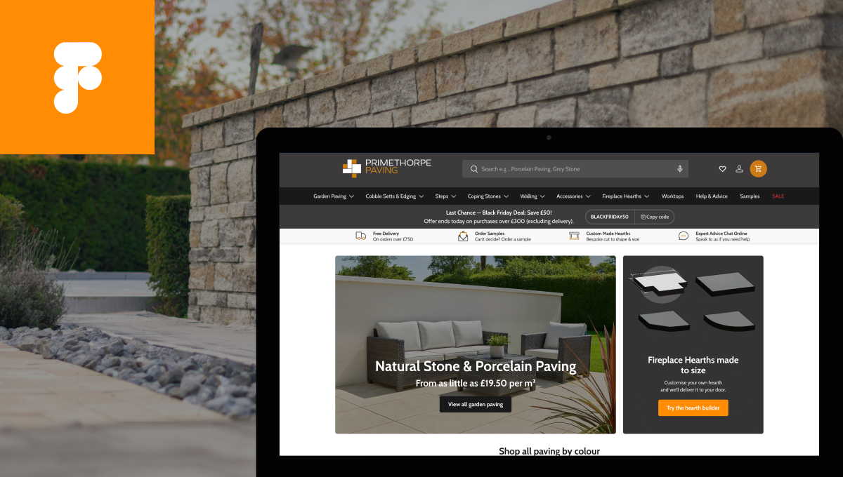
Primethorpe Paving: A Full UI/UX Redesign Journey

Primethorpe Paving partnered with MageCloud to enhance website performance and increase conversions across both desktop and mobile devices. Through a completely redesigned UI/UX. We created a cleaner interface, faster navigation, and a seamless buying journey that led to higher conversions and increased revenue.
READ MORE

Cities we operate in