TECHNOLOGIES
INDUSTRIES
Need assistance? Talk to the expert

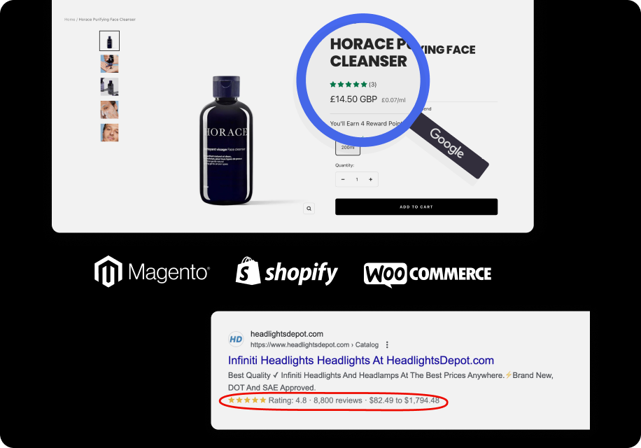
MageCloud Customers
Discover how ecommerce businesses worldwide use MageCloud to power their success.
In the ever-evolving digital landscape, mobile commerce has emerged as a force to be reckoned with. With smartphones and mobile internet becoming ubiquitous, the rise of mobile commerce has been nothing short of astounding.
Statista’s data speaks volumes: in 2021, mobile ecommerce claimed a staggering 73.4% share of total ecommerce sales, and this dominance is projected to continue with a forecasted 72.9% share in 2023. These remarkable statistics underscore the immense importance of mobile commerce in shaping the future of online business.
In today’s increasingly mobile-centric world, keeping up with the trends in mobile commerce is more important than ever. Thus, it is imperative for eCommerce businesses to invest in enhancing their mobile experience offerings for customers.
Moreover, some retailers need to improve their mobile experience for customers aimed not to miss out on a growing shopper segment and significant sales potential.
If you’re interested in venturing into mobile ecommerce but unsure where to begin, this article is for you.
Table of Contents:
With the popularity of mobile shopping with more people than ever before using mobile devices for shopping, retailers must keep pace with this rapidly growing consumer behavior to avoid falling behind. Statistics indicate that mobile is on its way to becoming the preferred method of online shopping.
A mobile-friendly ecommerce website ensures that users can seamlessly navigate it on their mobile devices. The website adjusts to fit the smaller screen, eliminates unusable features and flash animations, reduces image size, and simplifies navigation.
Although mobile conversion rates are slightly lower than desktop conversion rates (1.81% vs. 1.98%), it doesn’t mean that mobile optimization should be disregarded. A mobile ecommerce website can serve as the initial touchpoint for users who later convert on a desktop after conducting product research on their phones. In fact, a survey revealed that 67% of customers are less likely to engage with a brand that lacks mobile optimization.
The benefits of having a mobile-friendly ecommerce website go beyond improved conversion rates:
Mobile optimization may seem like a minor aspect, but its impact on your ecommerce business can be significant. It can boost sales, increase traffic to your main website, and ensure a successful online presence.
When it comes to creating a mobile version of your eCommerce website, three distinct approaches exist: mobile-friendly, mobile-optimized, and responsive designs.
Web and mobile ecommerce designs differ significantly due to various factors:
Understanding the distinctions among mobile-friendly, mobile-optimized, and responsive designs helps tailor your eCommerce site to provide the best user experience across different devices.
As mobile commerce continues to thrive, it’s crucial to prioritize the mobile experience of your ecommerce store. To help you achieve this goal, we have compiled seven practical strategies that will optimize your mobile site and drive customer satisfaction.
Enhancing the mobile shopping experience for your ecommerce store requires careful planning and implementation. Here are seven tips to help you achieve success:
Gaining a comprehensive understanding of your users is essential. Having a deep knowledge of your customers is crucial in order to create a remarkable mobile user experience (UX). Before diving into the design of your mobile commerce site, take the time to familiarize yourself with your customers’ shopping behaviors, identify potential pain points they may encounter, and understand their ultimate goals.
However, relying solely on assumptions is insufficient. It is necessary to delve deeper into the thoughts and preferences of your website visitors, gathering concrete evidence to support your understanding.
There are various methods available to collect valuable UX feedback from your customers. Consider employing incentive-led surveys, social media polls, organizing focus groups, and engaging in discussion forums. By gathering both positive and negative feedback about their experiences, you can accurately identify what aspects are effective and what areas require improvement.
In the fast-paced world of mobile browsing, speed is everything. A delay of just a few seconds can significantly impact user engagement and conversion rates. Use speed analyzing tools to identify areas for improvement and optimize your mobile commerce site for fast loading times. Minimize unnecessary code, reduce plugin usage, and optimize images to create a lightning-quick browsing experience.
Mobile users have little patience for slow-loading websites. Optimize your site to reduce loading times, especially on critical pages like the checkout process, to minimize cart abandonment and retain potential customers.
Did you know that nearly half of all customers expect websites to load within a mere 2 seconds? Any longer than that, and they’re likely to abandon ship. It’s not just users who prioritize speed—Google also factors in loading times when determining the ranking of your website in search results.
The speed of your website plays a significant role in both organic traffic and customer satisfaction. Take Walmart, for example, who observed that each second of improved website speed resulted in a 2% increase in conversions, and even a mere 100ms improvement translated to a 1% boost in revenue.
Thus, ensuring fast page load times is essential in retaining visitors and encouraging engagement.
In addition to speed, you should also focus on delivering relevant and easily readable content. Google suggests using a base font size of 16 CSS pixels to enhance readability and accessibility on mobile devices.
To assess the mobile-friendliness of your site and identify areas for improvement, Google’s mobile-friendly test tool is a valuable resource.
Recommended Reading:
? Technical SEO Issues You Shouldn’t Be Ignoring
A cumbersome and cluttered navigation system can instantly drive shoppers straight into the arms of your competitors. Today’s consumers seek effortless mobile interactions, so it’s crucial to keep your mobile navigation concise, consistent, and easily accessible.
Mobile navigation should be intuitive, so it is important to get straight to the point by eliminating unnecessary elements. The objective is to streamline the mobile navigation experience by minimizing cognitive load, scrolling, and clicking.
When designing your mobile site’s navigation, take a moment to consider the following questions, both from your perspective and that of your users:
By having clear answers to these questions, you can determine which items should be included in your mobile navigation.
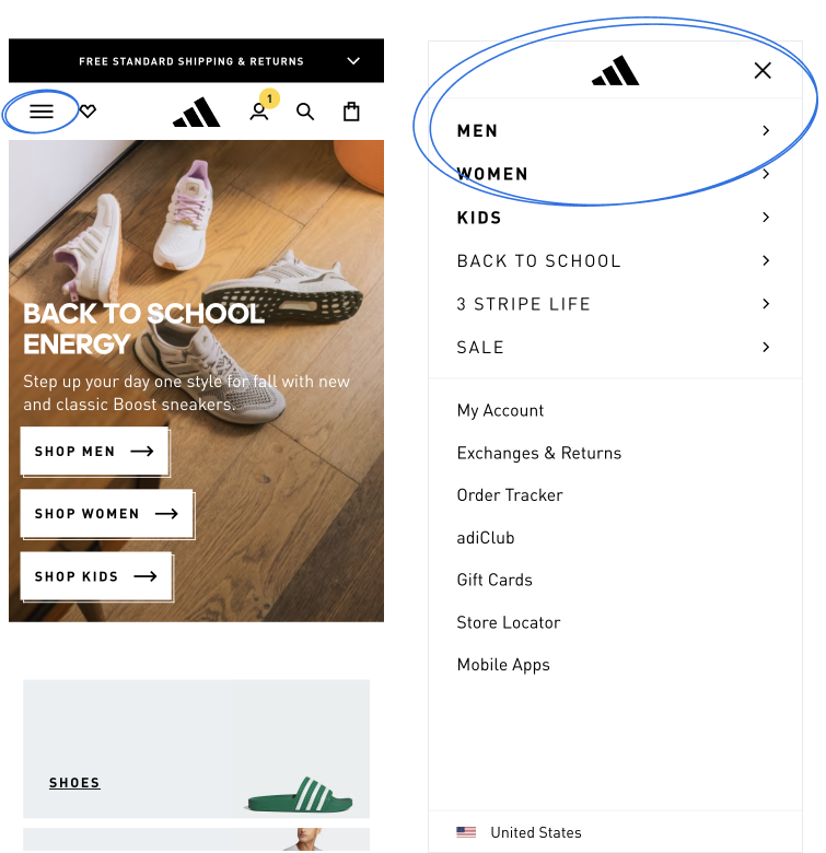
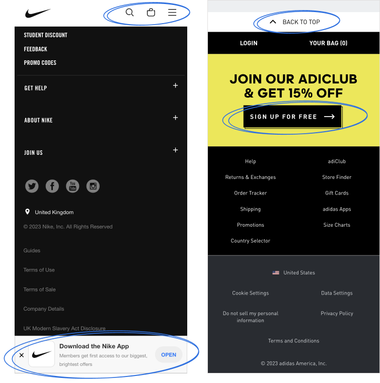
[Menu: Adidas]
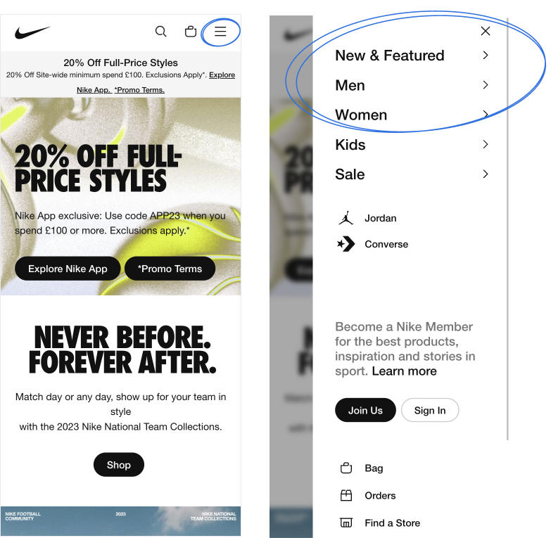
[Menu: Nike]
For a clutter-free mobile user experience (UX), the hamburger menu is the way to go. Neatly tucking everything away, prevents users from feeling overwhelmed with choices and helps avoid decision fatigue. It also provides direct access to navigation, allowing shoppers to click directly to their desired pages, resulting in improved usability and speed.
TIP:
To prevent users from feeling overwhelmed, it is advisable to limit your mobile navigation to a maximum of four to eight items on the top level. Remember that your mobile navigation menu should not include links to every single page on your website.
Navigating your mobile commerce site should be effortless. Utilize a clear and simple language that precisely conveys what users can expect, and ensure the font size is large enough to be easily read without the need for zooming.
Consider implementing an image-based navigation menu to enhance the mobile UX even further. This approach maximizes usability, enabling users to make swift navigation decisions and locate desired products with ease.
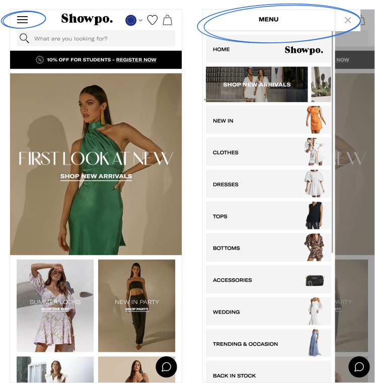
[Menu: Showpo]
Recommended Reading
? Mobile navigation: patterns and example -Justinmind
? Designing Navigation for Mobile: Design Patterns and Best Practices – Smashing Magazine
Effective on-site search is crucial for mobile eCommerce platforms, as users often have to navigate through numerous items to find what they’re looking for. To optimize your on-site search for mobile, consider the following strategies:
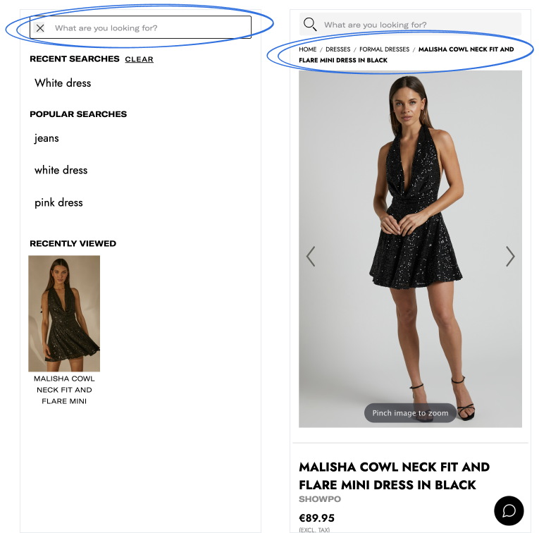
[Search & breadcrumbs: Showpo]
Breadcrumbs have long been a consistent and simple interface component. However, the rise of mobile-first design has necessitated modifications to these historical best practices.
Implement these practices for seamless single-line breadcrumbs that enhance UX and SEO on mobile.
Recommended Reading
? Best Practices for Designing Breadcrumbs for Mobile – Telerik
TIP: You can have control over how your breadcrumb URLs appear by implementing schema markup in the HTML of your web pages. Refer to Schema.org’s structured data for breadcrumbs for detailed instructions, and consult Google’s help documentation on breadcrumbs.
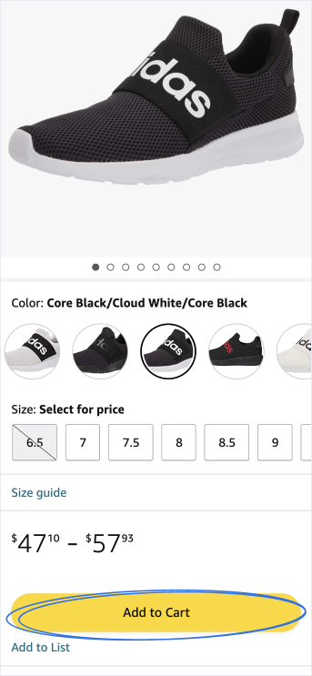
In the realm of ecommerce design, the ultimate goal is to persuade visitors to convert. One effective way to guide users toward making a purchase is by employing clear, compelling, and clickable calls to action (CTAs). Let’s delve into some best practices for crafting mobile CTAs that drive conversions.
Ensure that your CTAs are presented as clickable buttons that are thumb-friendly and stand out from other elements on the page. Utilize bold colors that create a contrast with the rest of the screen, capturing the user’s attention (while still adhering to your brand’s color guidelines, and avoiding random neon shades).
When it comes to the wording of your CTAs, keep the copy short, positive, and straight to the point. Utilize active commands such as “Buy Now” and “Add to Cart” to convey a sense of urgency and inspire immediate action from your customers.
[CTA: Amazon]
Consistency in your CTAs across your mobile commerce site is key. By using uniform button styles and wording, you help users become familiar with the CTAs, ultimately guiding them swiftly through their purchasing journey.
Consider implementing a fixed CTA button on your mobile product pages. This provides users with the convenience of completing a purchase at any given moment. As they scroll and explore more about the product, they can easily add it to their cart with a quick tap.
When it comes to product pages, optimizing them for mobile screens is crucial.
Improving the accuracy, completeness, and consistency of product information can boost conversion rates by 17% to 56%.
To create an engaging product page, consider it as a virtual salesperson. It should enable customers to visualize themselves using the product.
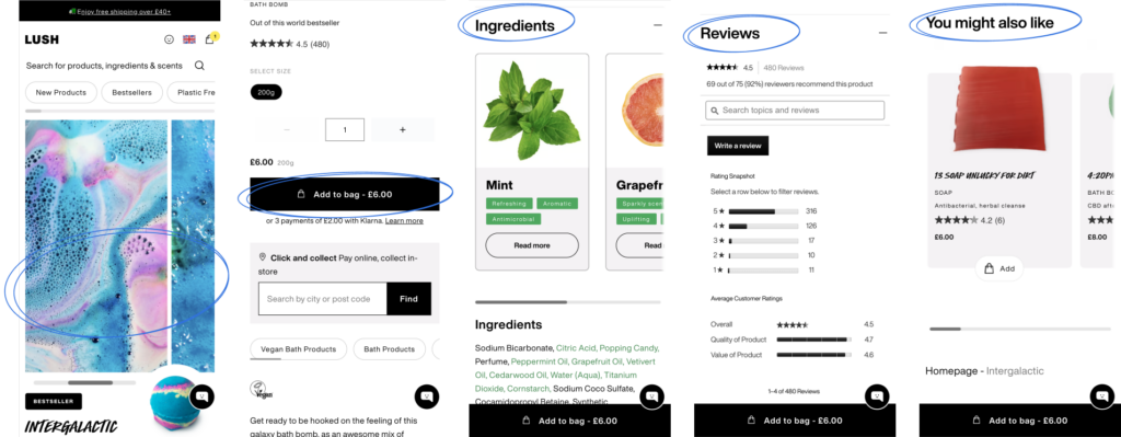
[Product page: Intergalactic Bath Bomb – Lush]
While the product descriptions should not be compromised in terms of content, it is recommended to keep them concise (max 200 characters) and position them just above the fold, accompanied by high-quality product photos.
Avoid excessive scrolling, collapsible content blocks, and overly sensitive tapping. Including a “back to top” button is beneficial, but ensure it doesn’t interfere with smooth scrolling.
To provide personalized product recommendations, start by optimizing your website’s product descriptions. Clear and concise descriptions enable shoppers to grasp important details before making a purchase. Utilize bullet lists to facilitate the scanning of essential product information.
By optimizing product pages with compelling information, you can drive sales and enhance the eCommerce customer experience.
Lengthy and complex forms can be a major deterrent for mobile shoppers. Simplify your forms by including only essential fields and optimizing their layout for mobile screens. Position form fields within thumb-reach and minimize unnecessary spacing. By streamlining the form process, you can enhance user experience and reduce cart abandonment.
Recommended Reading
? Best Practices For Mobile Form Design – Smashing Magazine
Don’t overlook the importance of the footer in your mobile commerce UX. While not the flashiest element, when properly utilized, it becomes a valuable navigational tool, providing essential links to shipping rates and return policies. Such information directly influences buying decisions, making a seamless user experience (UX) imperative.
Ensure your footer is easily discoverable, predictable, and consistently present. Avoid the mistake of hiding or collapsing the entire footer, as shoppers expect its presence and often reference it.
Give priority to footer content and employ clear, conventional link names for seamless navigation. Consider dividing your footer navigation into distinct semantic sections, reducing cognitive load and enabling users to quickly locate desired information with a simple scan.
To optimize mobile UX, continuously learn, adapt, and engage with your consumers, keeping up with trends and changes. Regularly monitor, measure, and make improvements over time, conducting frequent tests and seeking feedback from your customers.
Avoid making UX decisions based solely on intuition; instead, iterate based on real user behavior. Whenever you make changes to your mobile e-commerce site, perform A/B tests to evaluate their impact on your conversion goals.
With mobile ecommerce experiencing rapid growth, neglecting the UX of your mobile site is not an option. Implement these seven straightforward strategies to deliver a seamless mobile shopping experience to your customers and unlock increased sales from the small screen!
In 2000, Amazon revolutionized the eCommerce industry with its super-simple purchase process, setting a gold standard for all businesses. Surprisingly, many retailers still offer complex, multi-step checkouts, which not only frustrate customers but also discourage them. According to Splitit, 87% of customers abandon their online carts if the checkout process is too complicated.
To enhance the user experience and maximize conversions, it is crucial to streamline your checkout process.
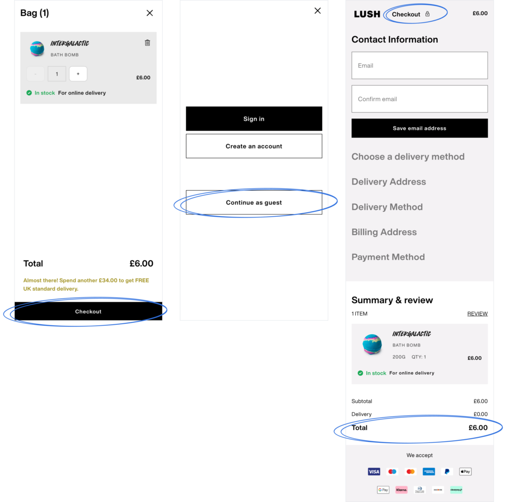
[Checkout process: Lush]
Implementing a guest checkout option instead of mandatory registration can significantly streamline the process. Minimize distractions and avoid requesting unnecessary information from shoppers. Prioritize data security by implementing a secure payment process, as customers are understandably concerned about their personal information when making online transactions. Additionally, offering a variety of payment methods will provide customers with flexibility and contribute to a seamless shopping experience.
Address users’ security concerns by offering trusted mobile wallet options and clearly communicating your commitment to data protection. Reassure customers about the security measures you have in place to build trust and increase conversion rates.
To create a truly customer-friendly webshop, it is essential to have an intuitive and simple checkout system.
By implementing these strategies, you can optimize the checkout process, enhance customer satisfaction, and reduce cart abandonment.
Connect your online store with social media platforms to engage with customers and enhance their mobile experience. Respond promptly to messages and comments, providing exceptional customer service through mobile channels.

[Social Media: Tieks]
Mobile devices have become the primary gateway for users to access social media platforms, presenting a valuable opportunity for brands to enhance their online presence. Here are some effective strategies to leverage social media on mobile:
Testing your ecommerce website for mobile responsiveness is crucial to ensure a seamless user experience across various devices. Keep an eye on loading speed, intuitive navigation, readability of information, and the placement of key elements on product pages.
Recommended Reading
? How to Optimize Your eCommerce Website For Mobile Devicess
The mobile-first approach goes beyond mere design principles; it plays a vital role in Google’s indexing and ranking algorithms. With half of the world’s web traffic originating from mobile devices, it is imperative for e-commerce businesses to prioritize creating an exceptional mobile shopping experience.
Now is the time to optimize your ecommerce website for mobile. Whether you choose a mobile-friendly design or develop a mobile app, keep these points in mind:
1. Prioritize Mobile Optimization: Mobile optimization is essential for ranking high on search engines. Even without a dedicated tech team or a large budget, make it a priority during your e-commerce development process.
2. Focus on Speed: Ensure that your mobile website is fast, if not faster than your desktop version. Optimize product images for mobile, use concise descriptions, and implement a streamlined, single-page checkout.
3. Enhance User Experience: A user-friendly mobile experience is crucial for higher conversion rates. Make product search easy, incorporate social media connectivity, and leverage mobile-native features to enhance your website’s functionality.
4. Embrace the Potential: Don’t underestimate the power of mobile for your ecommerce business. It has the potential to drive significant growth and unlock new opportunities.
By optimizing your ecommerce website for mobile, you can tap into the mobile trend and provide a seamless shopping experience for your customers, ultimately boosting your business’s success.
Get in touch, and we’ll provide you with a free audit of your website and show you where you can improve conversions.
Cities we operate in